THE FASHION AWARDS
Fashion is Culture
Identity
+
Typography
+
Save the Date
+
Ticketing
+
Invitations
+
Wayfinding
+
Social
+
+
Motion
Identity + Typography + Save the Date + Ticketing + Invitations + Wayfinding + Social + Email + Motion
IN ONE LINE
A winning pitch for The Fashion Awards: an identity built from pixels, where every guest is one point in the bigger picture of fashion.
CLIENT
British Fashion Council
ROLE
Creative Director
SECTOR
Luxury Fashion, Events
TEAM
BFC’s in-house producer and directors
The Brief
One identity for every touchpoint of the night.
The Fashion Awards is the British Fashion Council's gala at the Royal Albert Hall, with more than 3,000 guests and a global online audience. It also raises money for the BFC Foundation.
The BFC asked for a new creative identity built on its existing brand guidelines. It had to work everywhere: save-the-dates, invitations, tickets, menus, signage, screens, social and sales decks. The guidelines would then go to every agency on the event.
“A global entertainment platform with a focus on world class performances, digital first experiences and collaboration, cementing fashion firmly at the intersection of the creative culture industries.”
THE FASHION AWARDS
THE PITCH
Two Rounds, Two Routes, One Final Picture
We answered the brief with one theme, Fashion is Culture, and two ways in. The route that won was Pixel.
Pixelation
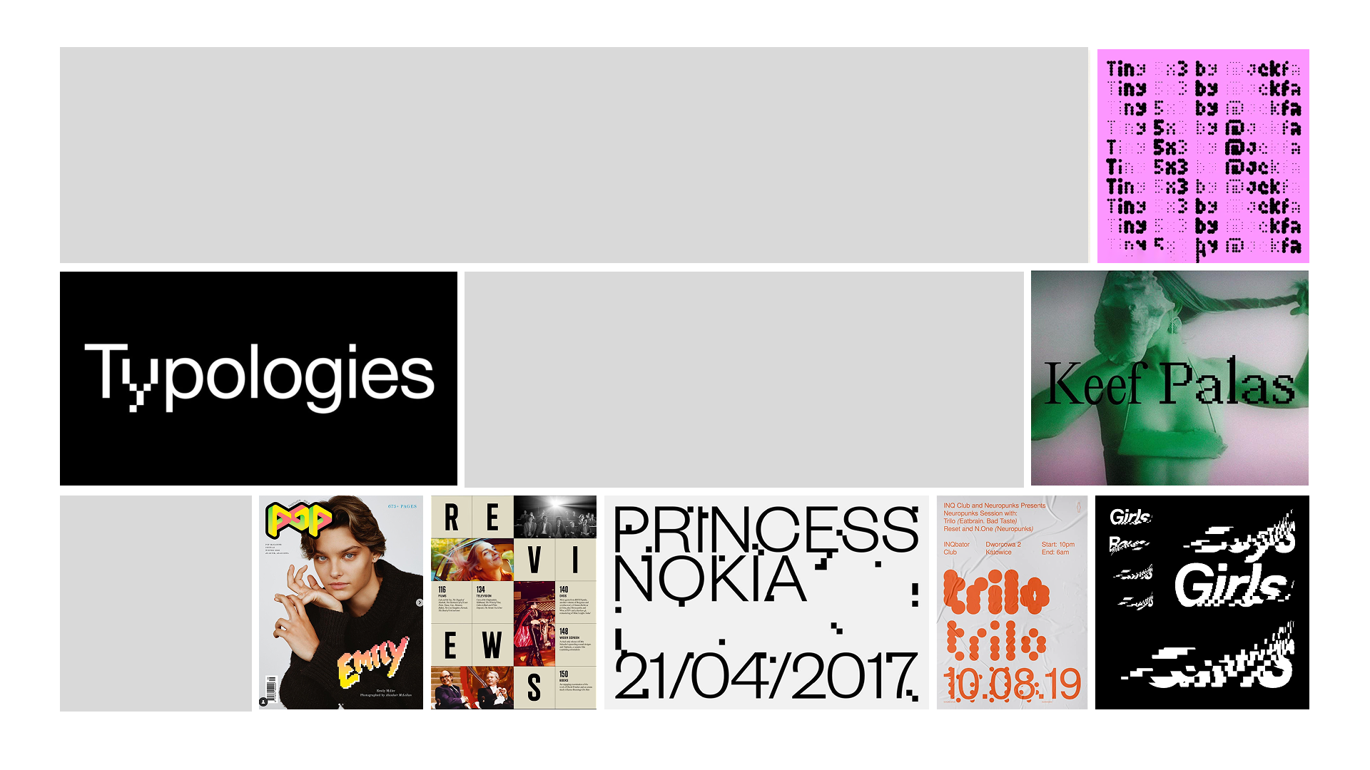
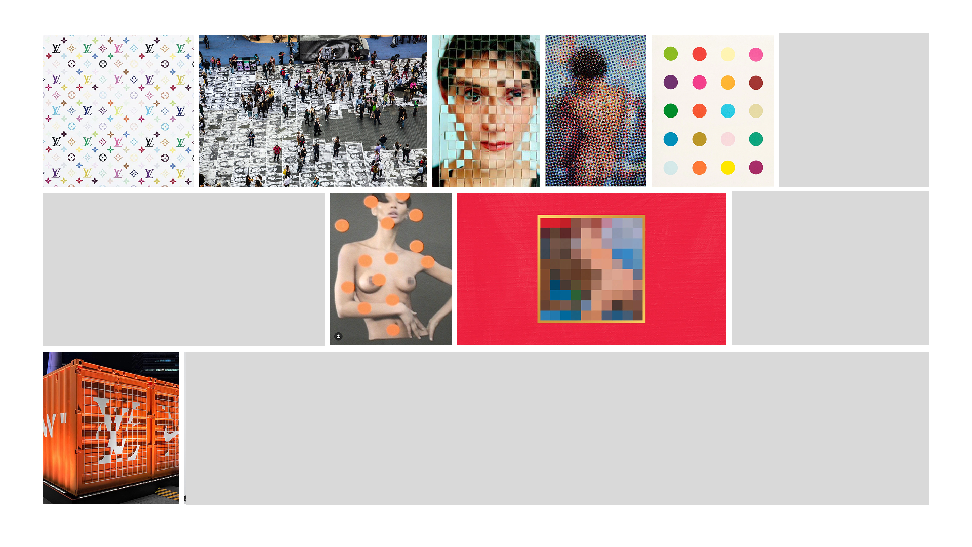
A pixel is a minute point of light. On its own, it says very little. Together, millions of them make an image. Fashion works the same way: designers, makers, models, press and guests, each one point, together forming the bigger picture.
We are the sum of our parts. The idea is borrowed from the loom, where single threads are woven into cloth. Here the threads became dots, and the guests on the night became the fabric of the fashion community.
Pixels are collaborative. They combine in endless intensities to make millions of interpretations of one image. The treatment explores reveal and contrast: things and people coming together, scattered points resolving into type, so every message arrives the way the night does, many parts becoming one.
DEVELOPING THE SYSTEM
Hand-set Type, Digital Texture
The look borrows from two worlds. On one side, the quiet authority of fashion typography: high-contrast serifs, generous spacing, the restraint of a couture invitation. On the other, the raw language of the screen: pixels, dither and the grain of low-resolution images.
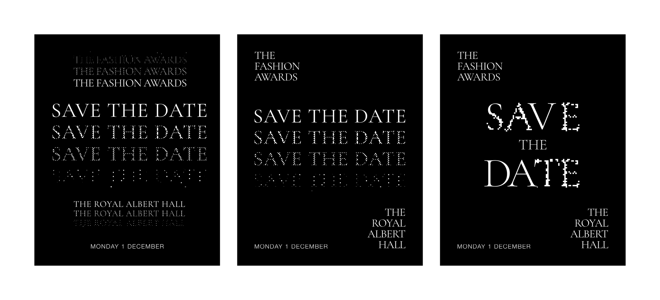
We kept the type classic and let the treatment do the talking. Each piece starts as clean lettering and dissolves into points, so every message sits halfway between print and code. Black and white throughout, so the texture carries the identity rather than colour.
We tested three treatments on the save-the-date: a transition from solid to scattered, a block build, and a gradient that fades the word into the page.
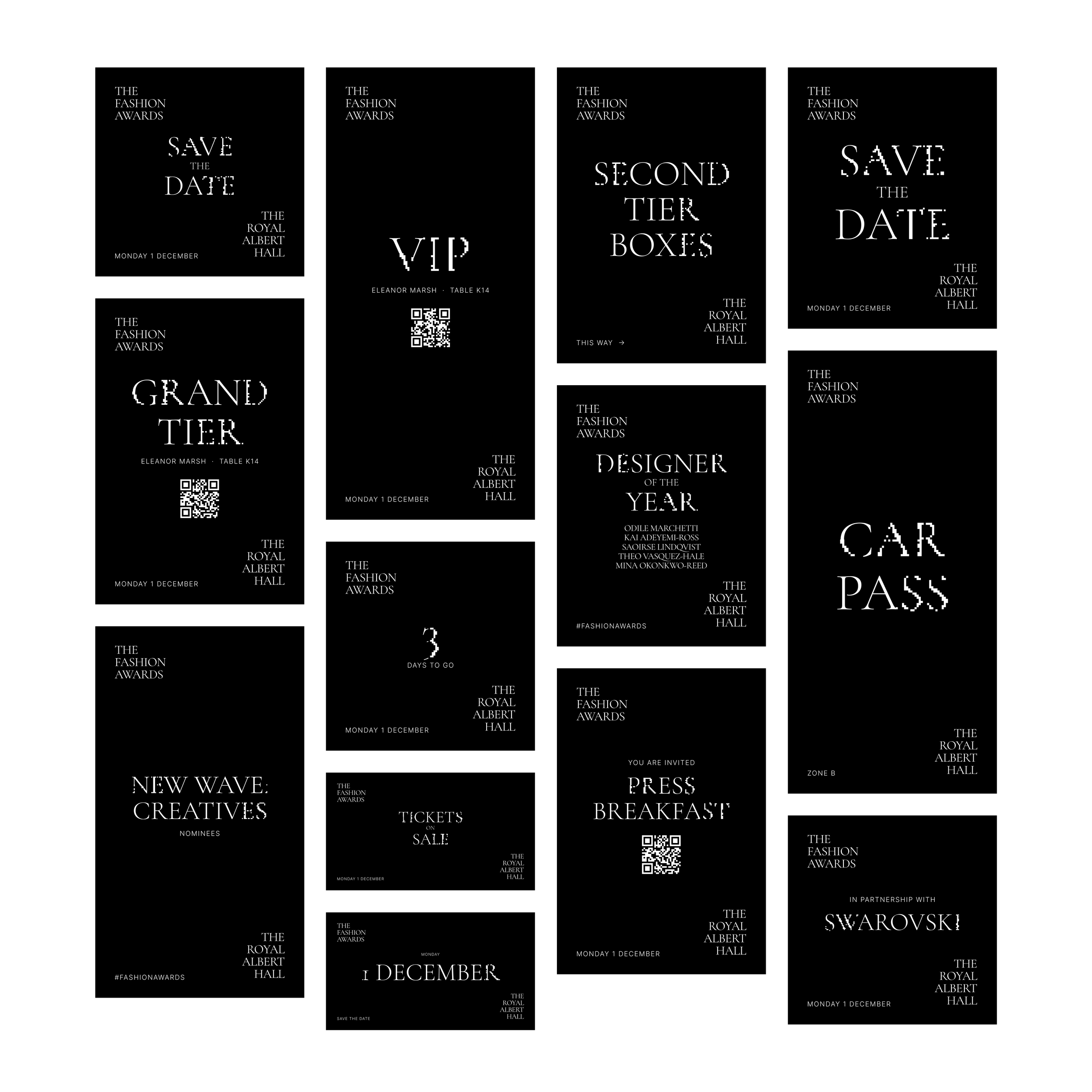
BRAND GUIDELINES
Won, With One Note: Keep it Black and White.
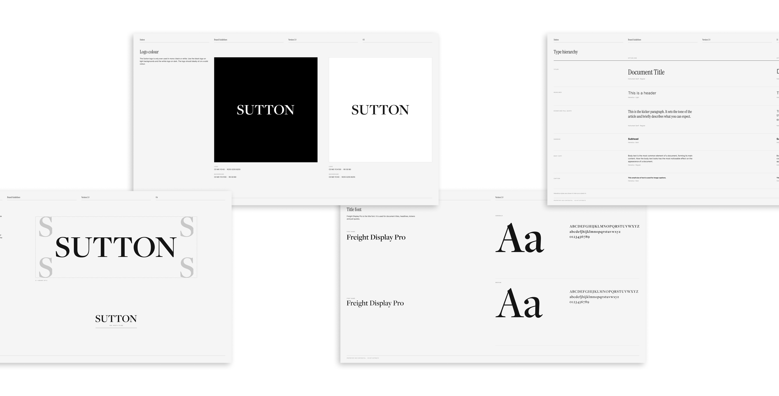
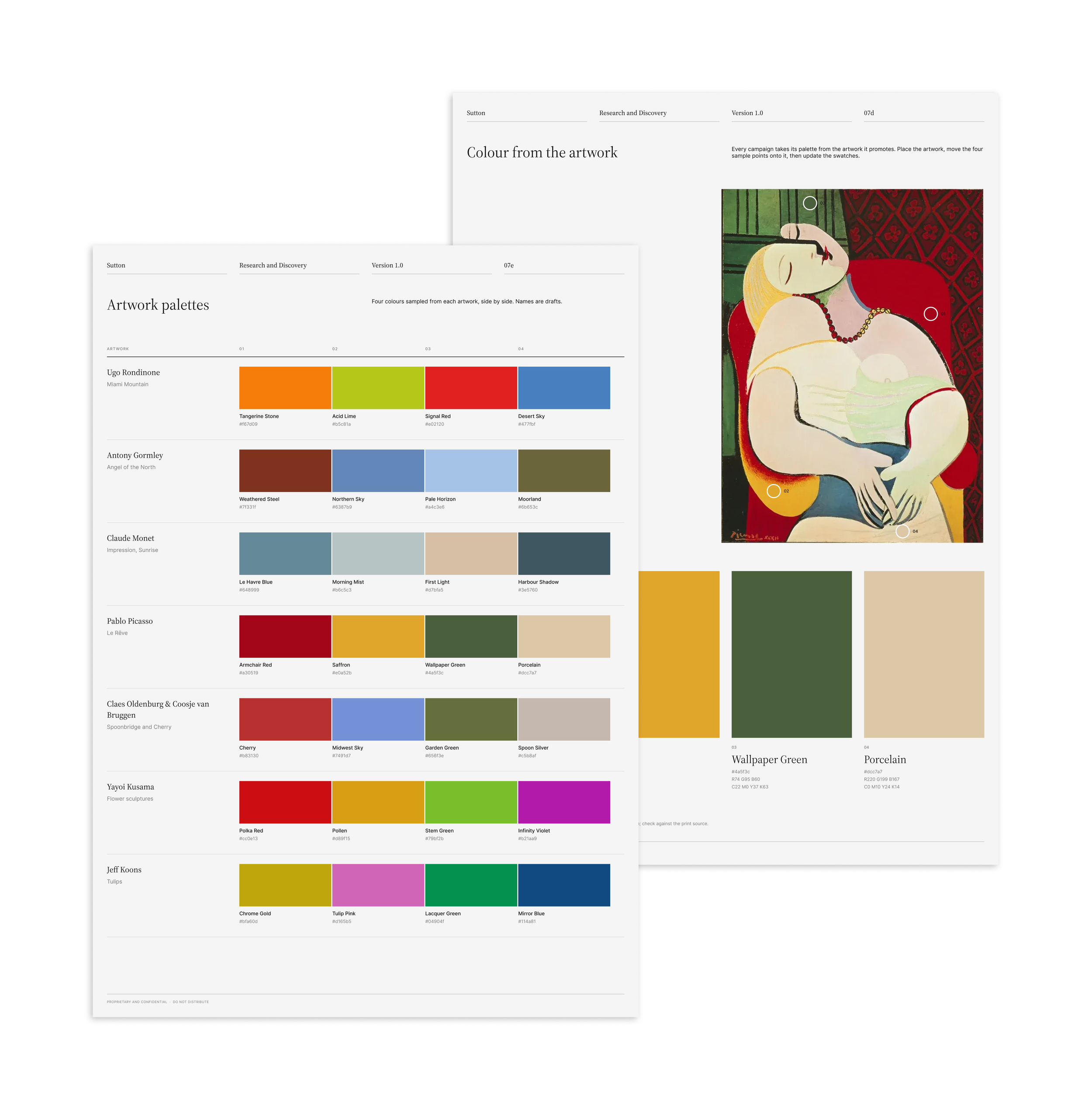
Once the wordmark was approved, I turned it into a system the team could use without me: a construction grid and anchor points so the mark is always set the same way, clear space so it never feels crowded, and a small mark for social icons. A primary and tertiary palette, with colourways that flex with the art being featured, and a typography list completed the set, all in a short guidelines document.
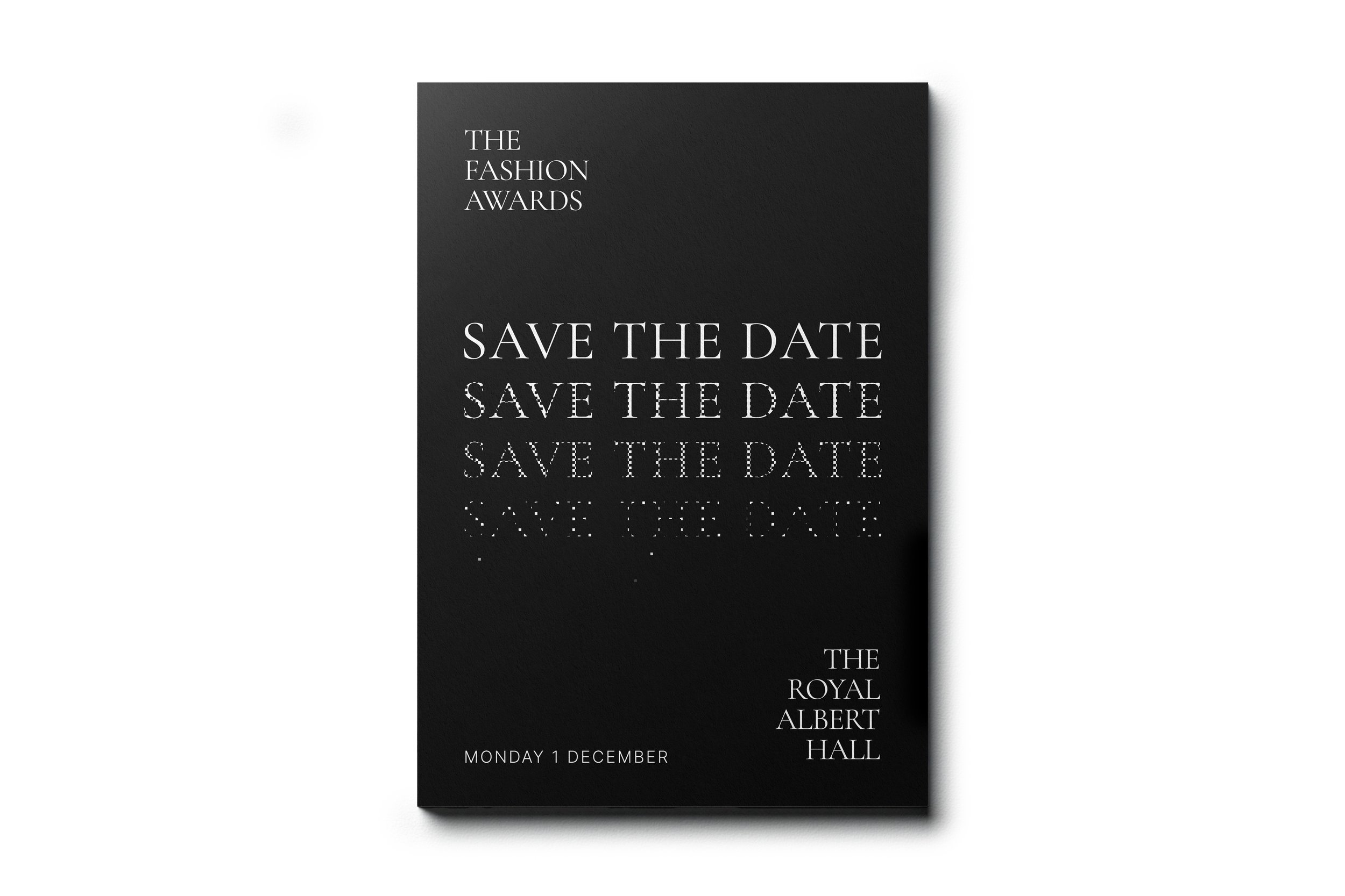
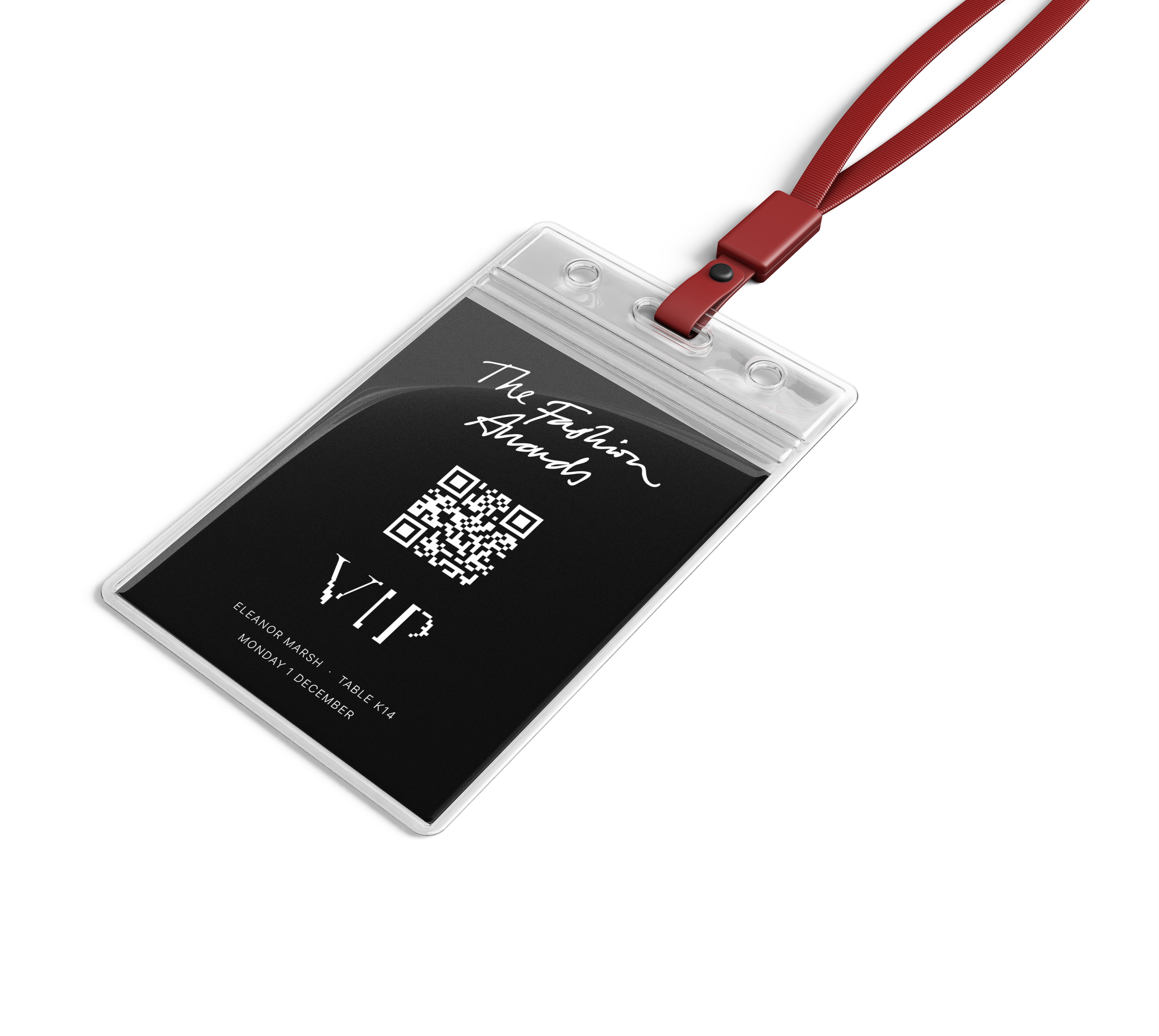
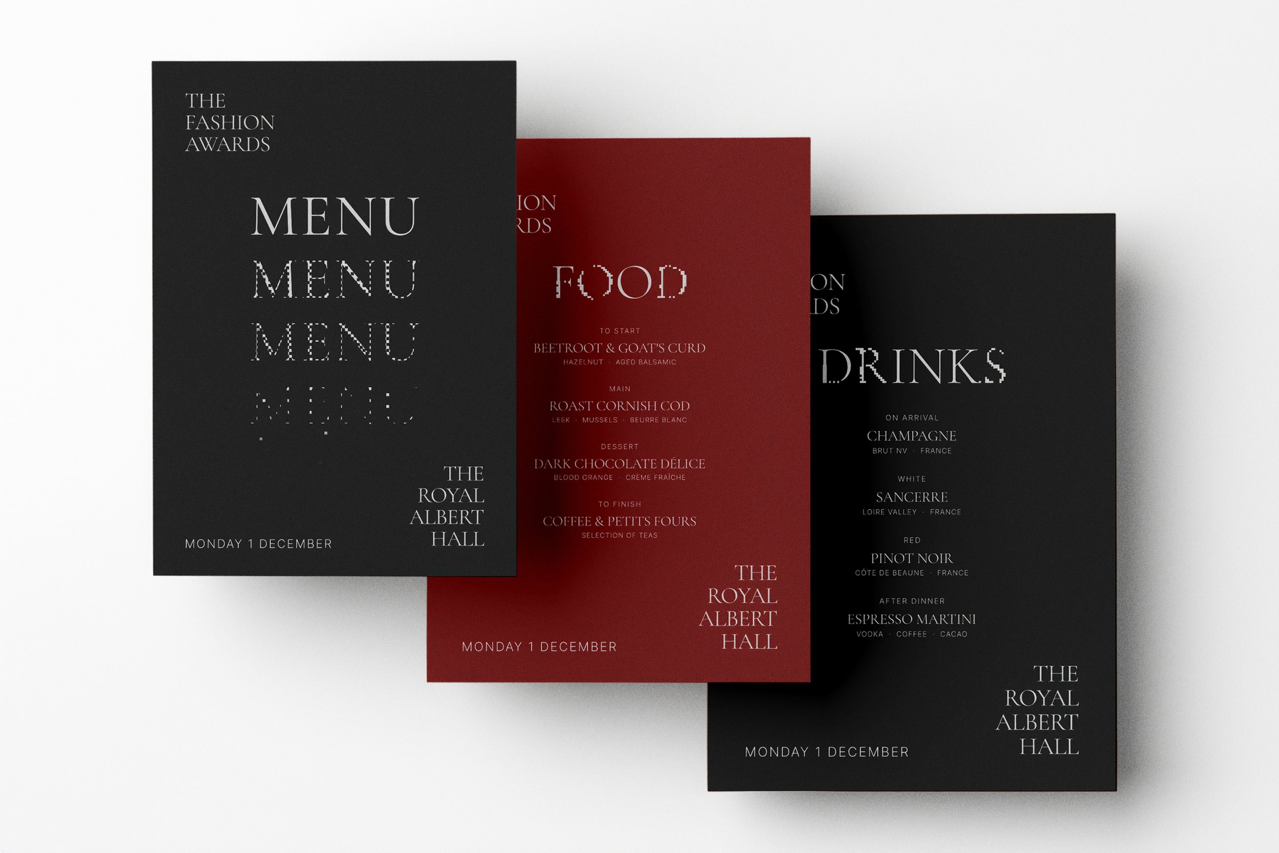
THE LOOK AND FEEL
A guide for every agency on the night
The look-and-feel guide set the rules: Kawingan for headlines, Europa for body copy, and pixelation as the motion behaviour, with copy moving in and out through the grid.
IN USE CONCEPT VISUALS
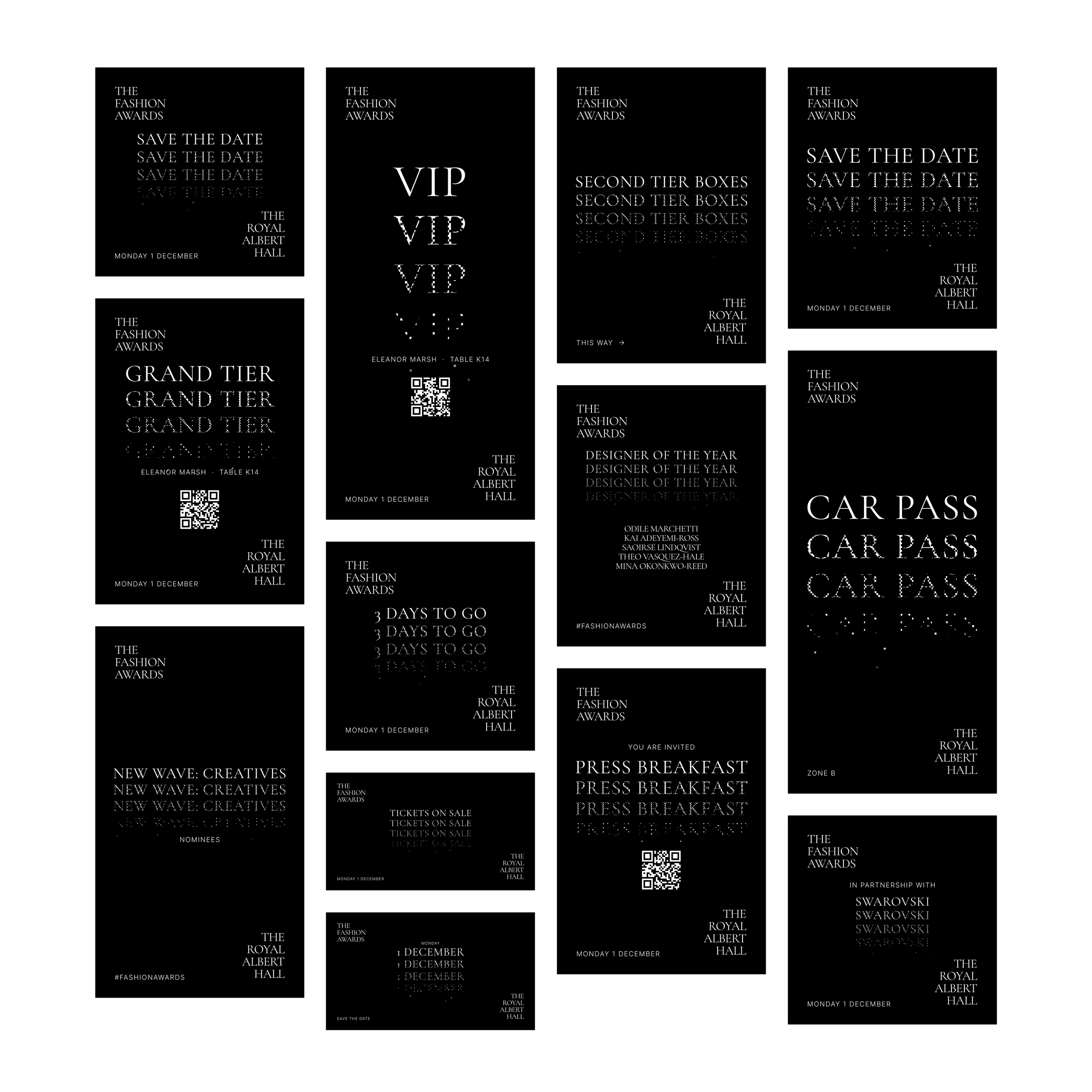
The Identity, Across the Night.
These show how the system would work from the first invitation to the last post. They are
concept visuals made for this case study, not photos of the event.