THE DUBAI MALL
The Mall, in the Pocket
Art Direction
+
UX/UI Design
+
Product Strategy
+
Launch Strategy
+
Art Direction + UX/UI Design + Product Strategy + Launch Strategy +
CLIENT
The Dubai Mall
ROLE
Digital Art Director
SECTOR
Retail
TEAM
Creative, UX, Strategy, Technology, Content
THE CHALLENGE
The Dubai Mall is the most visited shopping mall in the world and an entertainment destination in its own right. Its website and app were not.
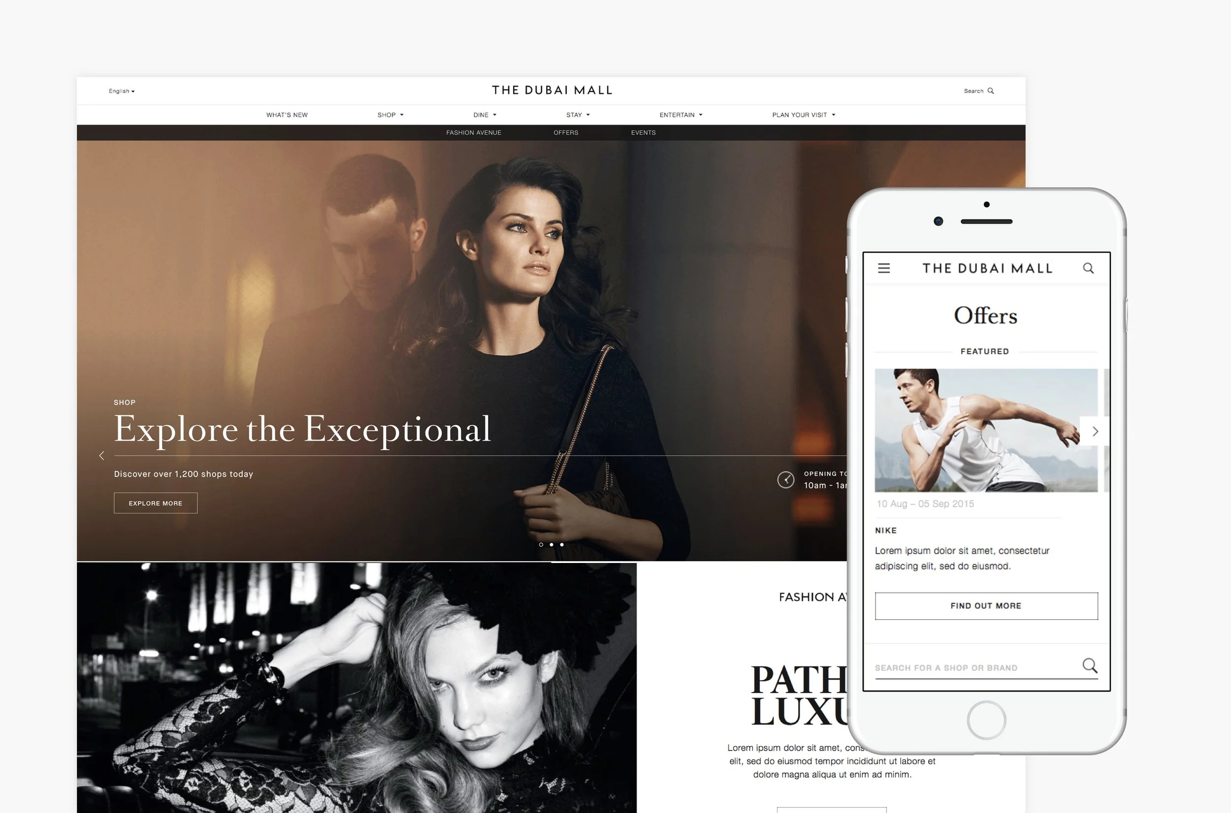
The brief was to re-imagine both "to create an experience worthy of the mall itself", with a specific job to do: position the new Fashion Avenue, help visitors plan a visit and find offers, evolve the mall's visual identity, and present the business as an innovative adopter of technology. The vision put it plainly - a world class digital experience to match a world class entertainment destination.
Research in the mall showed where the experience broke down. Visitors looking for a specific brand or product searched shop by shop and often gave up. Regulars kept to the routes they knew and missed whatever was new. Arrival and departure - parking, finding the car again, finding a taxi - coloured how people felt about the entire visit and whether they would return.
The problem was never a shortage of things to see. It was that a mall of this scale is hard to read, and nothing online helped a visitor before, during or after they arrived.
THE IDEA
We ran the research as contextual inquiry, observing visitors in the mall as they went about their own visits rather than setting them tasks. Seven groups took part, tourists and residents. We could not recruit local Emirati visitors, and said so in the findings rather than generalising from the rest.
What came out was a framework rather than a feature list. Every visit sits somewhere between utility and entertainment, and between efficiency and discovery, and the same person moves between them in a single trip. The app had to hold that balance, and every feature had to earn its place against evidence someone would use it.
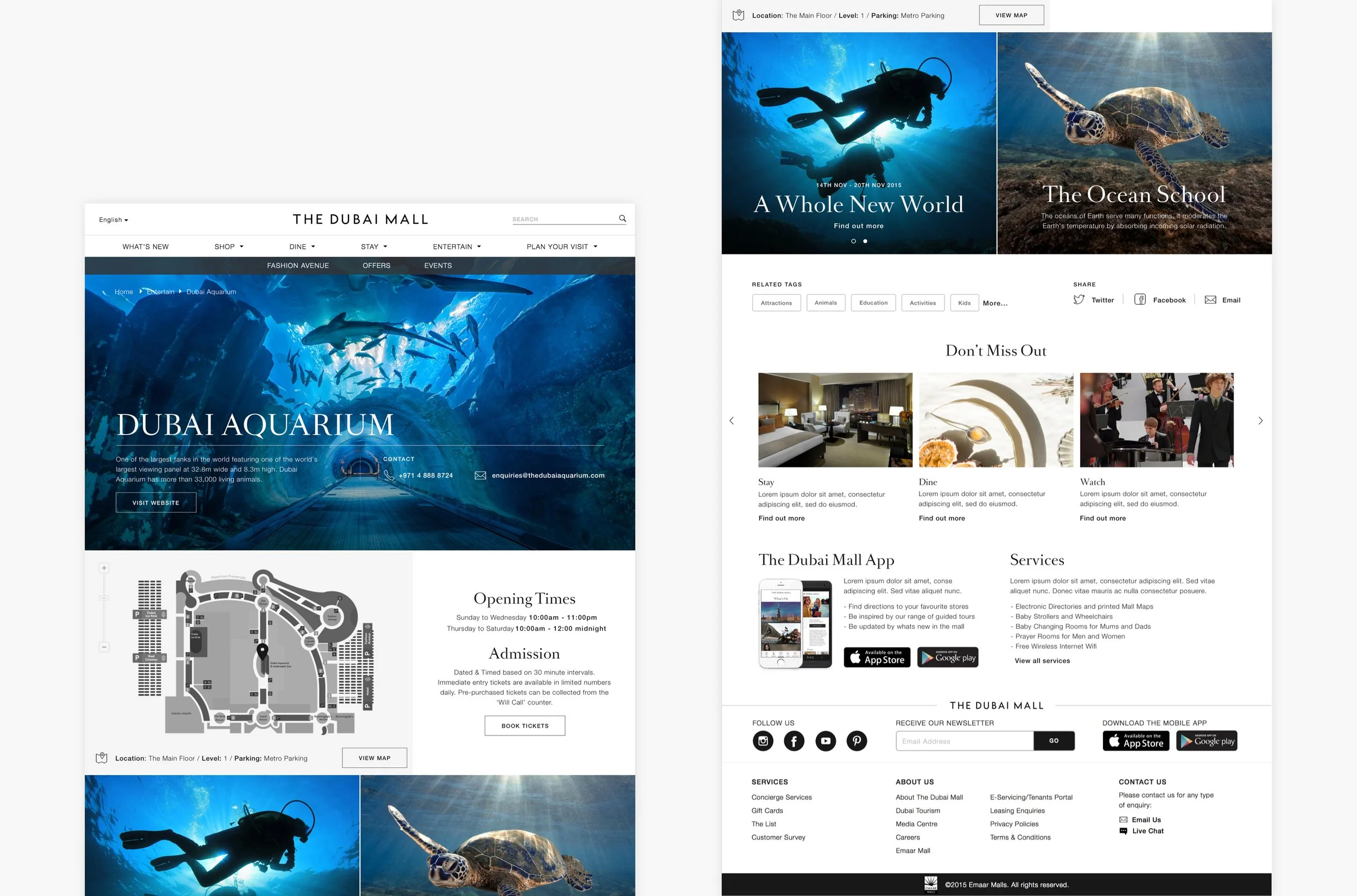
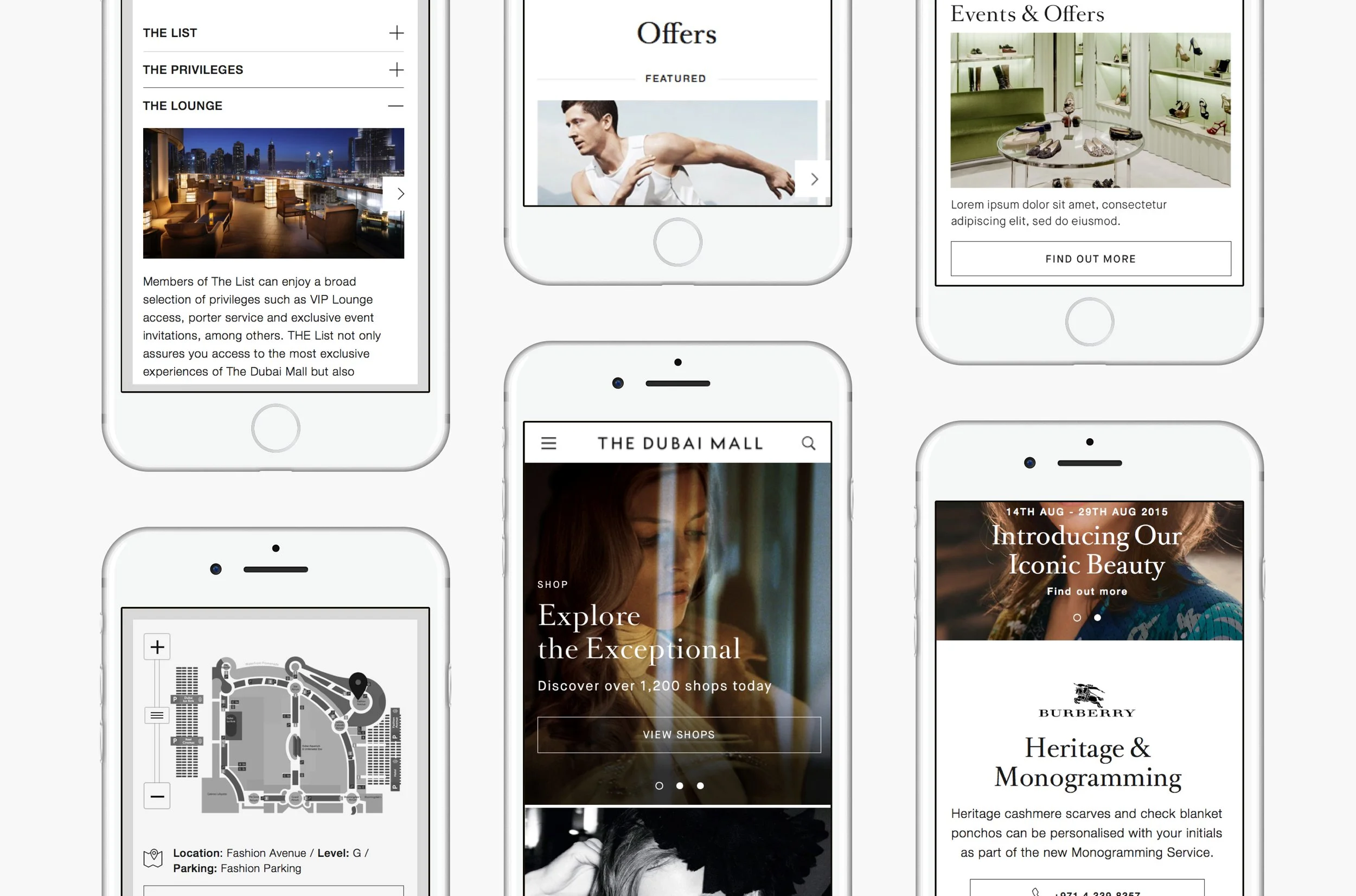
That gave the app its spine: point-to-point navigation with points of interest along the way, so wandering turns into discovery; search by brand or product, so an errand ends in a purchase; self-guided tours for regulars whose habits keep them on the same routes; and the arrival and departure utilities that colour a whole visit, from car park capacity to finding your car, the nearest taxi queue or prayer room.
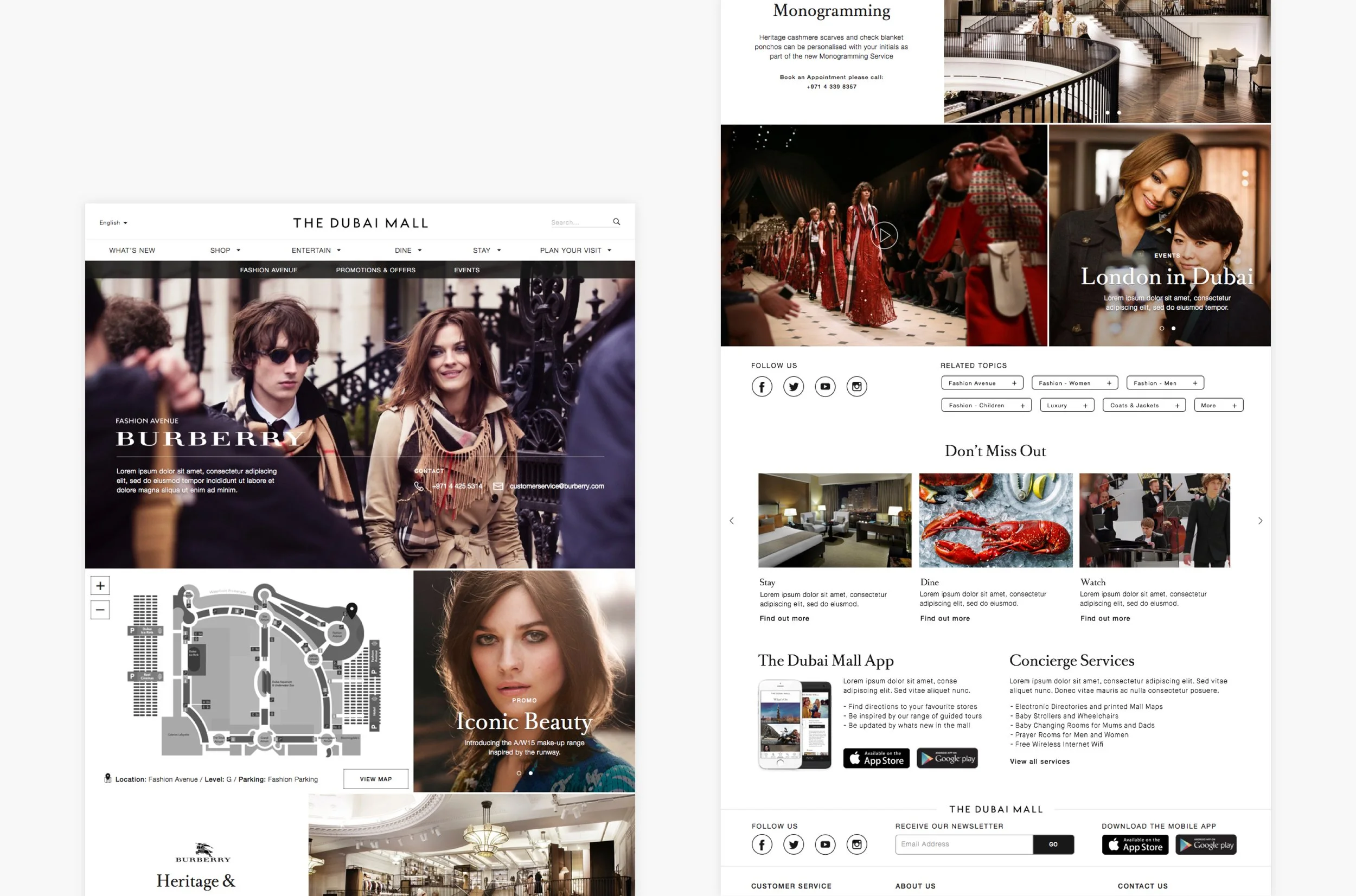
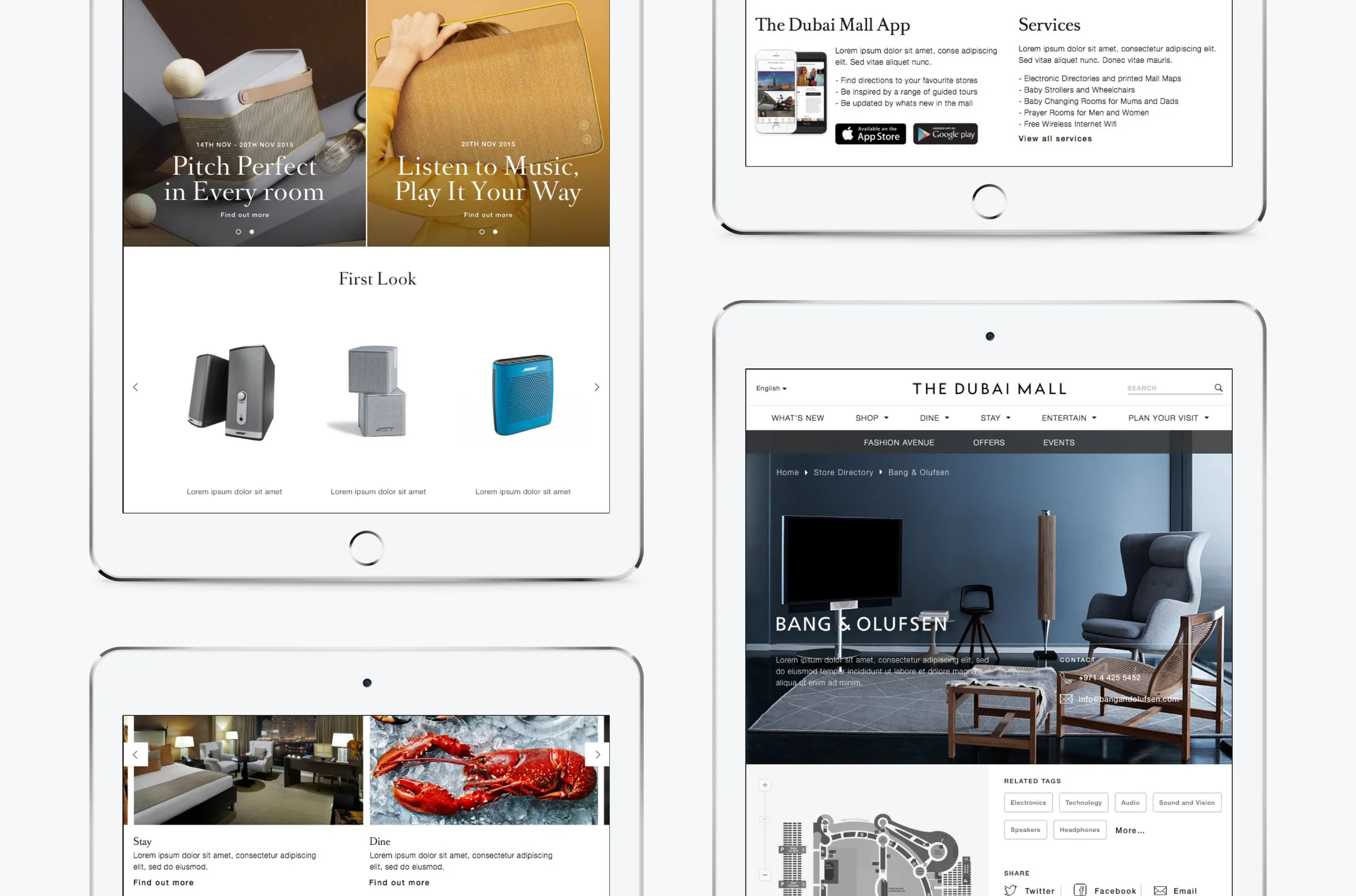
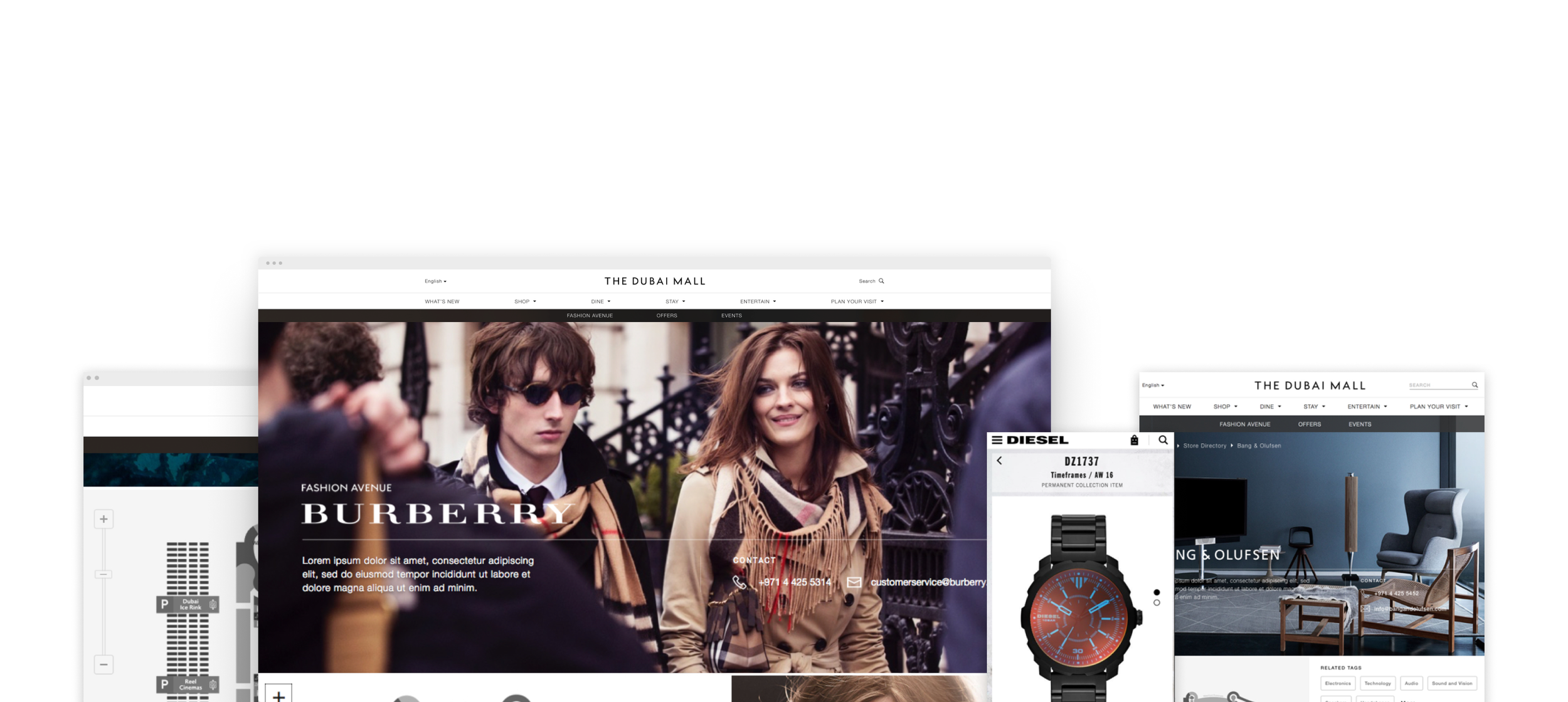
The website carried the same principles into content: clean navigation, search and filtering with no dead ends, full-bleed moving image and stills, and elevated store pages for the flagship tenants on Fashion Avenue. Editorial gave people a reason to return — Monthly Top Picks driving footfall by getting events into calendars, The Style Fix setting a weekly point of view on trends — each format planned across site, app, email and social with a stated frequency and a defined home.
Both platforms were phased: navigation, content, wayfinding and parking first; the personal visit planner, shopper wallet, service booking and personalised content held for phase two.