MARKETING WEBSITE & DESIGN SYSTEM
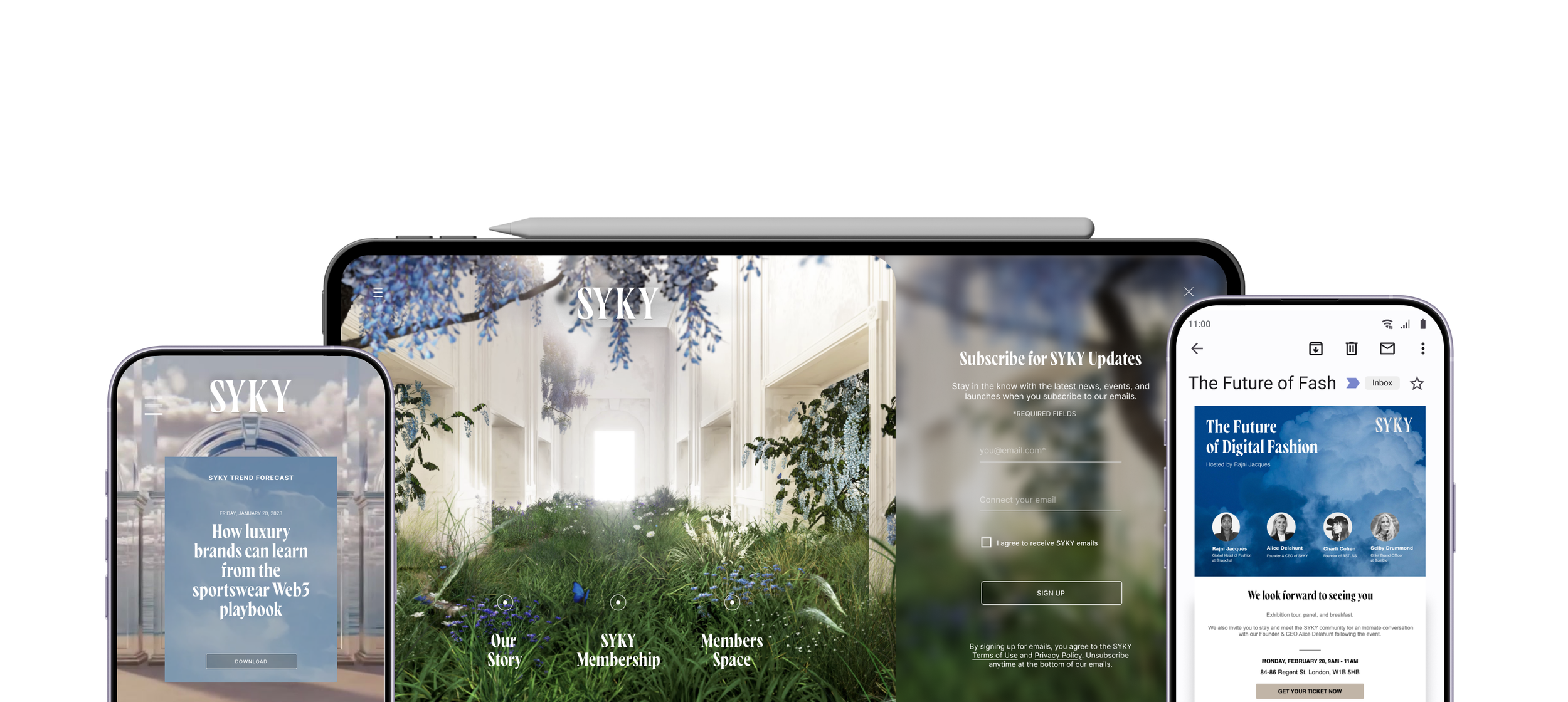
One System, Every Surface
Art Direction
+
UX/UI Design
+
Product Strategy
+
Launch Strategy
+
Art Direction + UX/UI Design + Product Strategy + Launch Strategy +
IN ONE LINE
Built to last, turning a throwaway launch micro site into a sustainable platform, the company began to grow its audience.
CLIENT
SYKY
ROLE
Product Design Director
SECTOR
Web3 & Metaverse, Luxury Collecting, Technology Platform
SECTOR
Founder, Creative & Engineering
THE PROBLEM
Selling a platform that didn't exist yet.
There was no marketplace to demo. The site had to carry the mint, the growing members' space, the company story, the future community programme and designer application route whilst being read as luxury by one audience and as a credible Web3 by another. Both audiences had to be convinced by the same scroll.
THE APPROACH
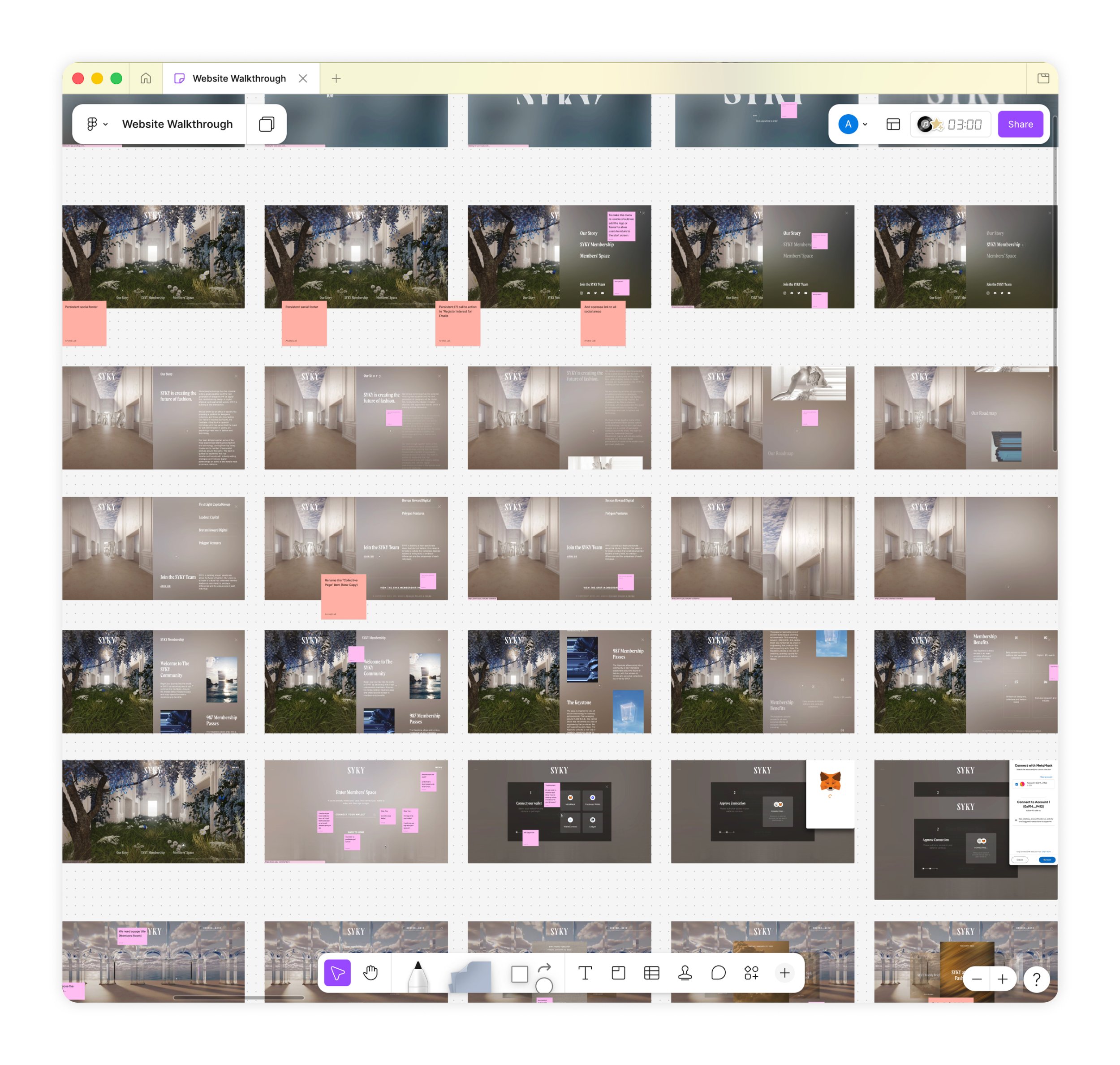
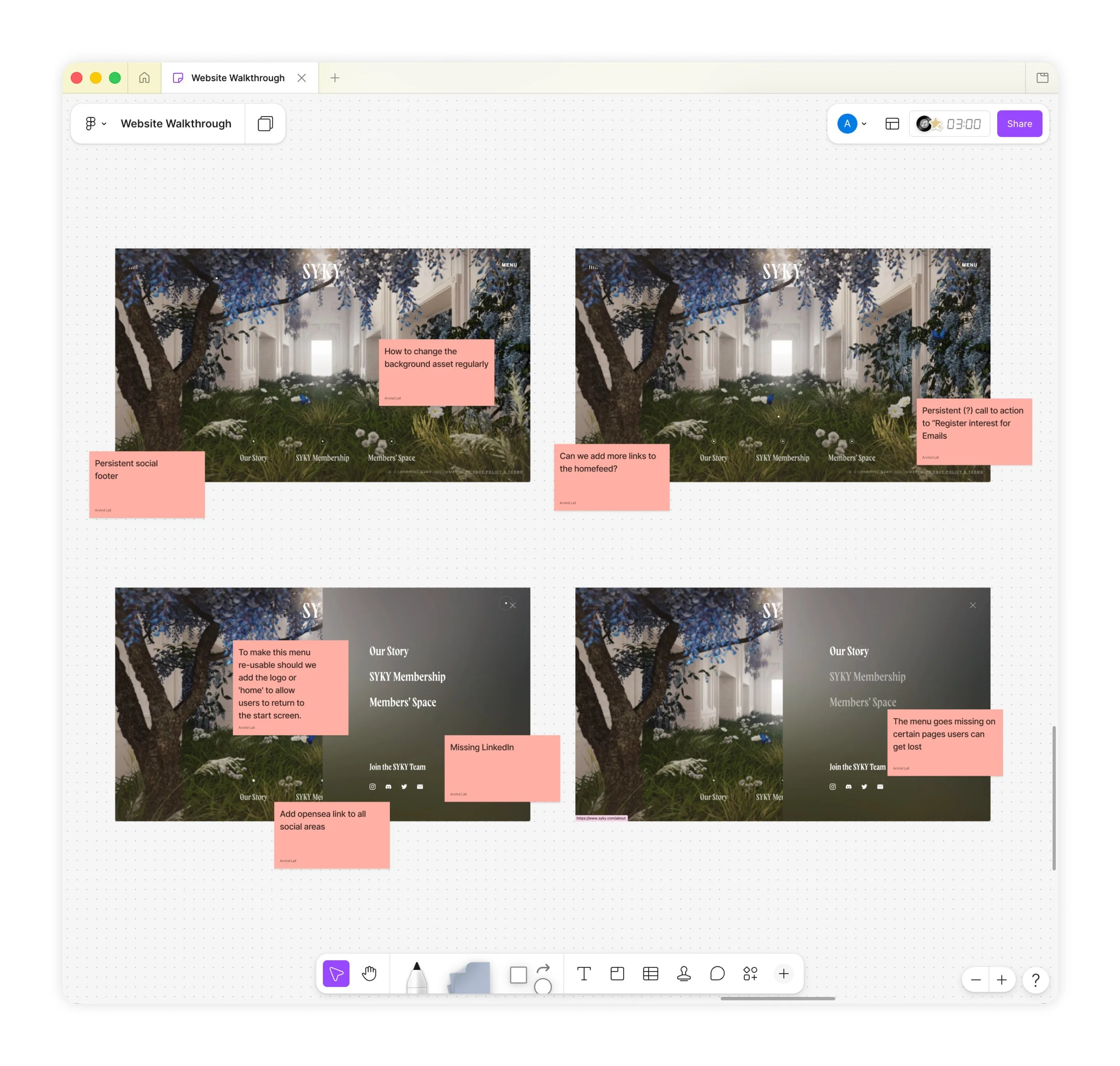
Before anything could be rebuilt, the site had to stop losing the user. From day one I worked through the microsite's mechanics and set out how we would refactor it to be reusable, so the team could keep expanding as SYKY's designers, services and activities grew rather than hard-coding a change every time the company moved forward. That meant being honest about what was already broken. I ran the site and the wider customer journey through a broken windows pass, looking for the small, visible problems that quietly signal neglect: a misaligned element, an inconsistent style, a broken link, a dead end in the journey. For a luxury brand these carry real weight, because a user's confidence in the product is built or lost in them.
THE SOLUTION
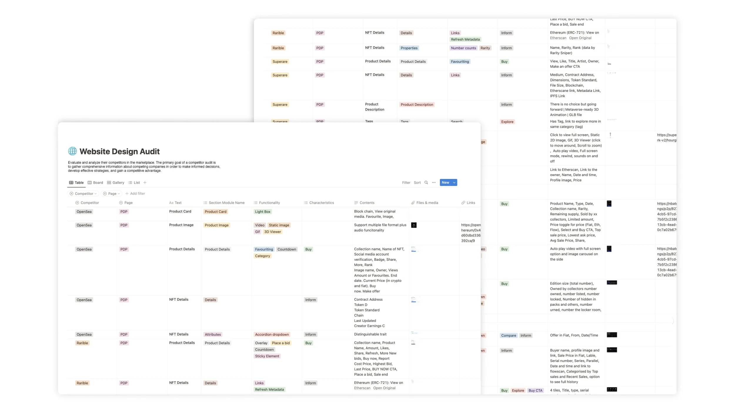
It was also tasked with helping build the working infrastructure. Written briefs explained the problem. Documented context so the new team members understood the principles they were designing within. I benchmarked against other Web3 and NFT platforms the audience already trusted and understood. Whilst creative exploration had its own phase instead of being squeezed between deadlines, this research fed each stage and acted as the spine of all work, so surfaces built by different hands still read as one.
WHAT CAME AFTER
One system, held across every surface.
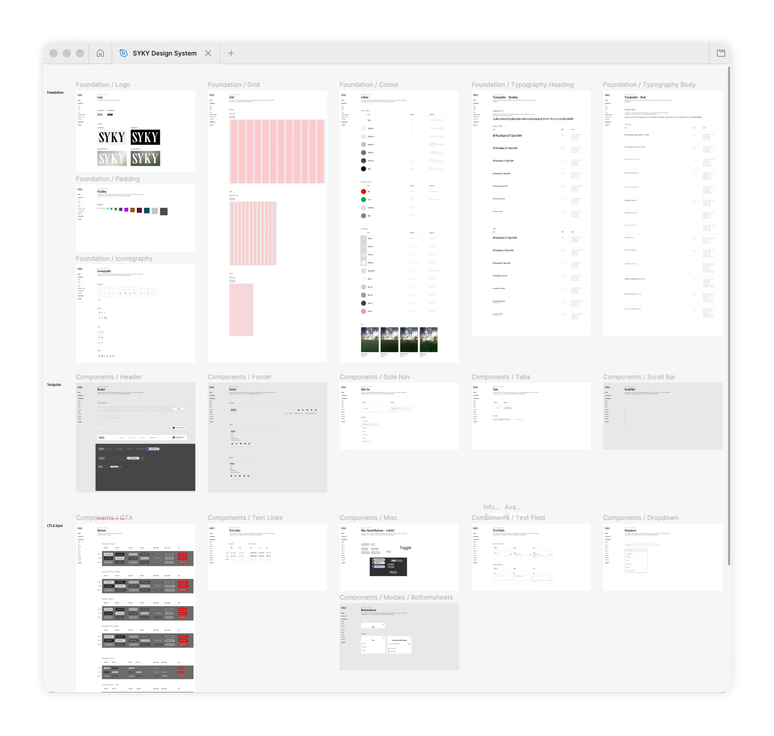
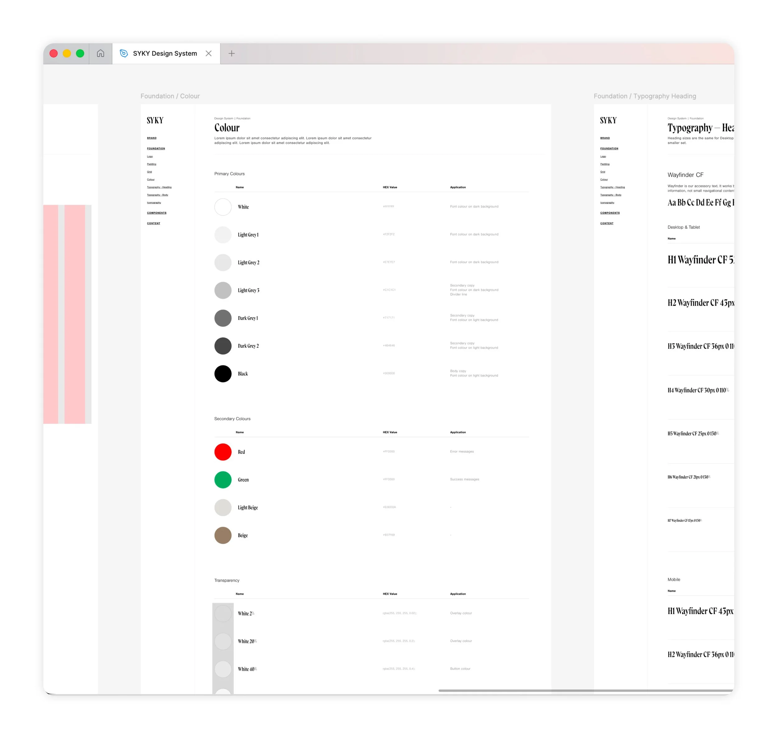
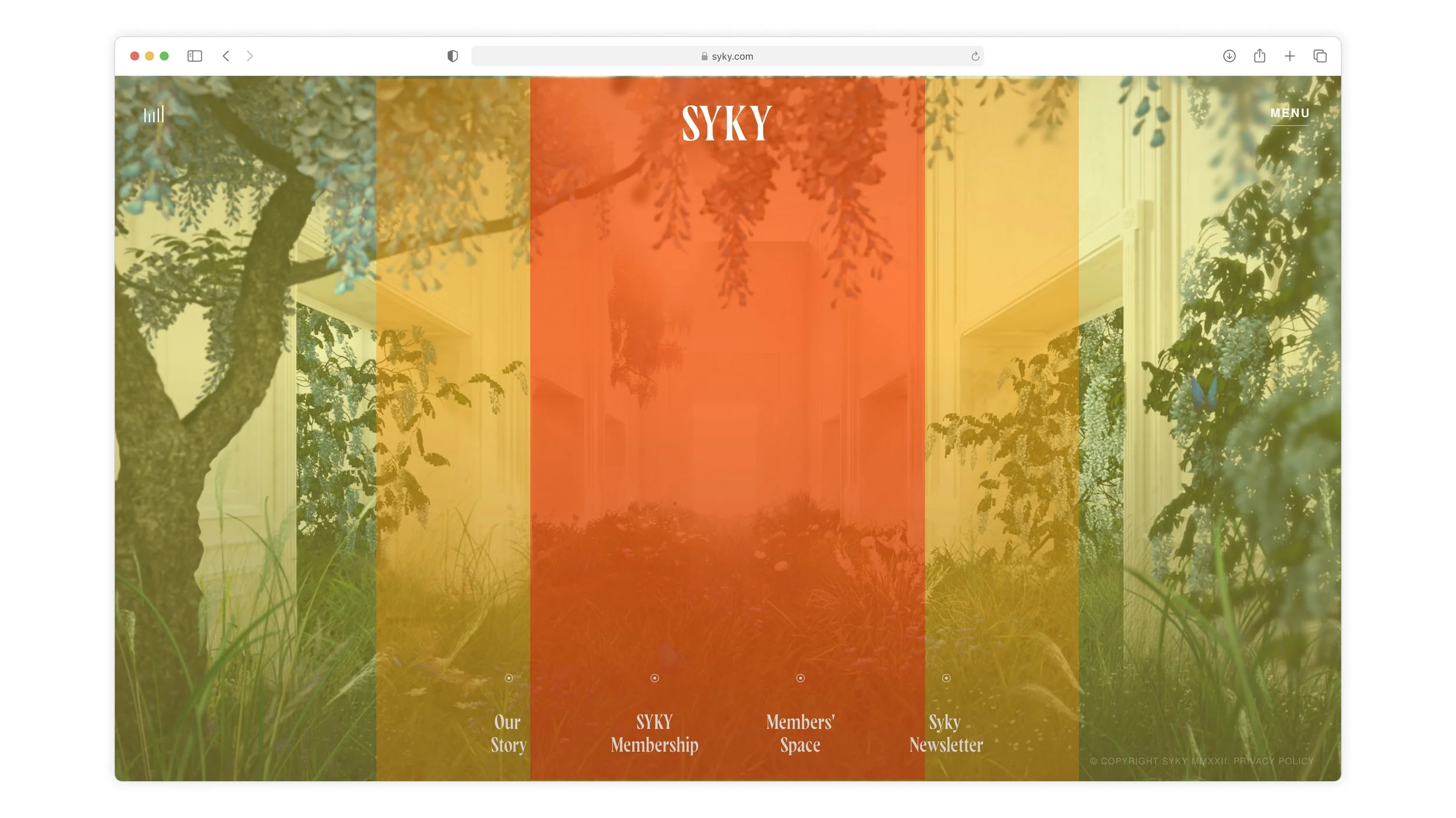
I documented the platform's core minimal principles to guide both the team and, eventually, its members in contributing their own expression. The design was deliberately minimal, allowing imagery and content to take centre stage. Clear, bold typography set against semi-transparent, blurred backgrounds held the customer journey together, so every page felt a click away and easy to explore.
THE APPROACH
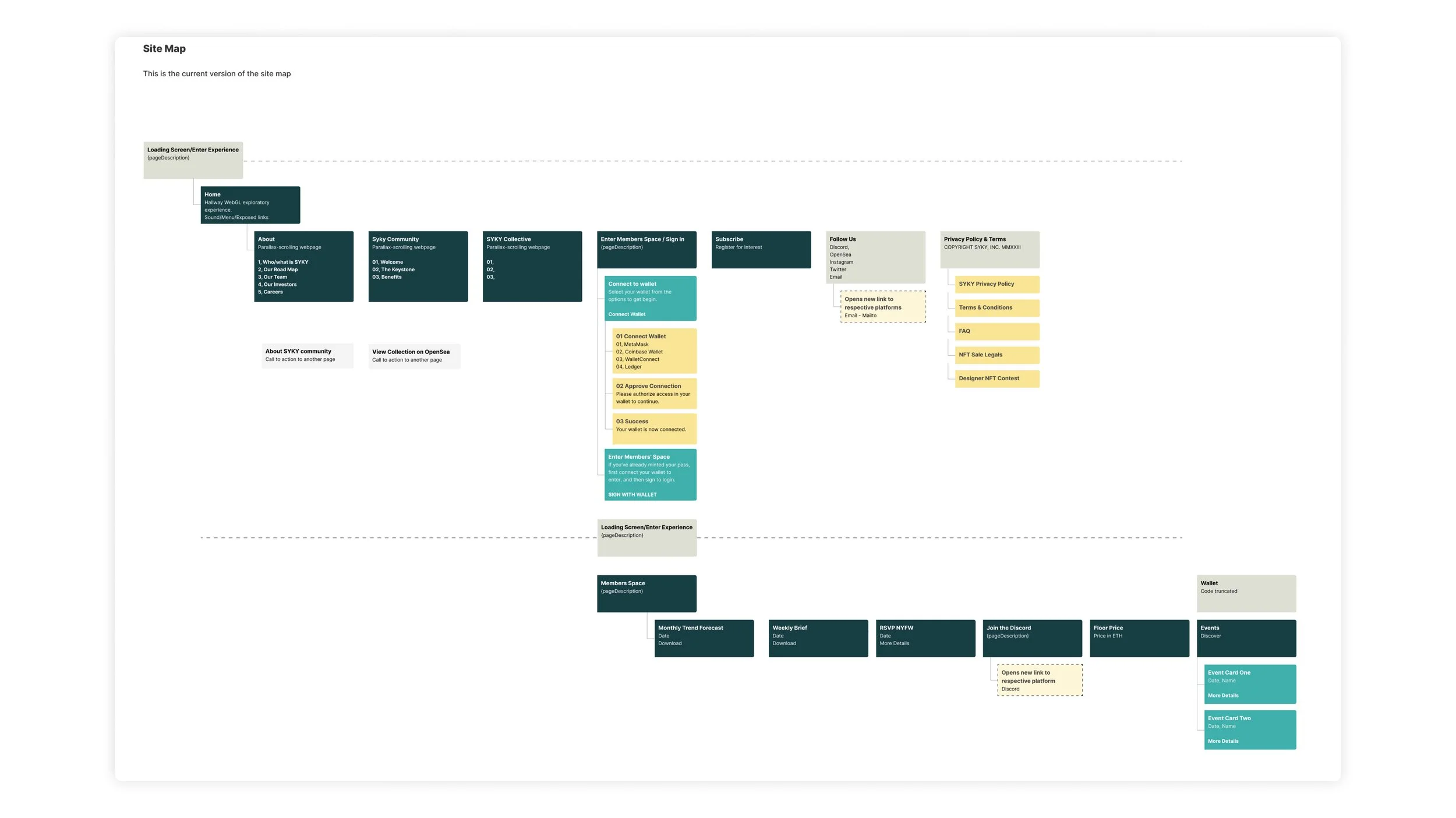
What emerged was a single system rather than a set of pages: a typographic and component library that every surface drew from. The homepage and story, the Keystone mint, the members' space, the designer application route, and the events programme were all built from the same parts, so you could add a new surface without inventing a new language. The site could then hold a membership, an open call and a company narrative in one structure, with any section reachable in a click.
THE SOLUTION
What emerged was a single system rather than a set of pages: a typographic and component library that every surface drew from. The homepage and story, the Keystone mint, the members' space, the designer application route, and the events programme were all built from the same parts, so you could add a new surface without inventing a new language. The site could then hold a membership, an open call and a company narrative in one structure, with any section reachable in a click.
KEY IMPROVEMENTS
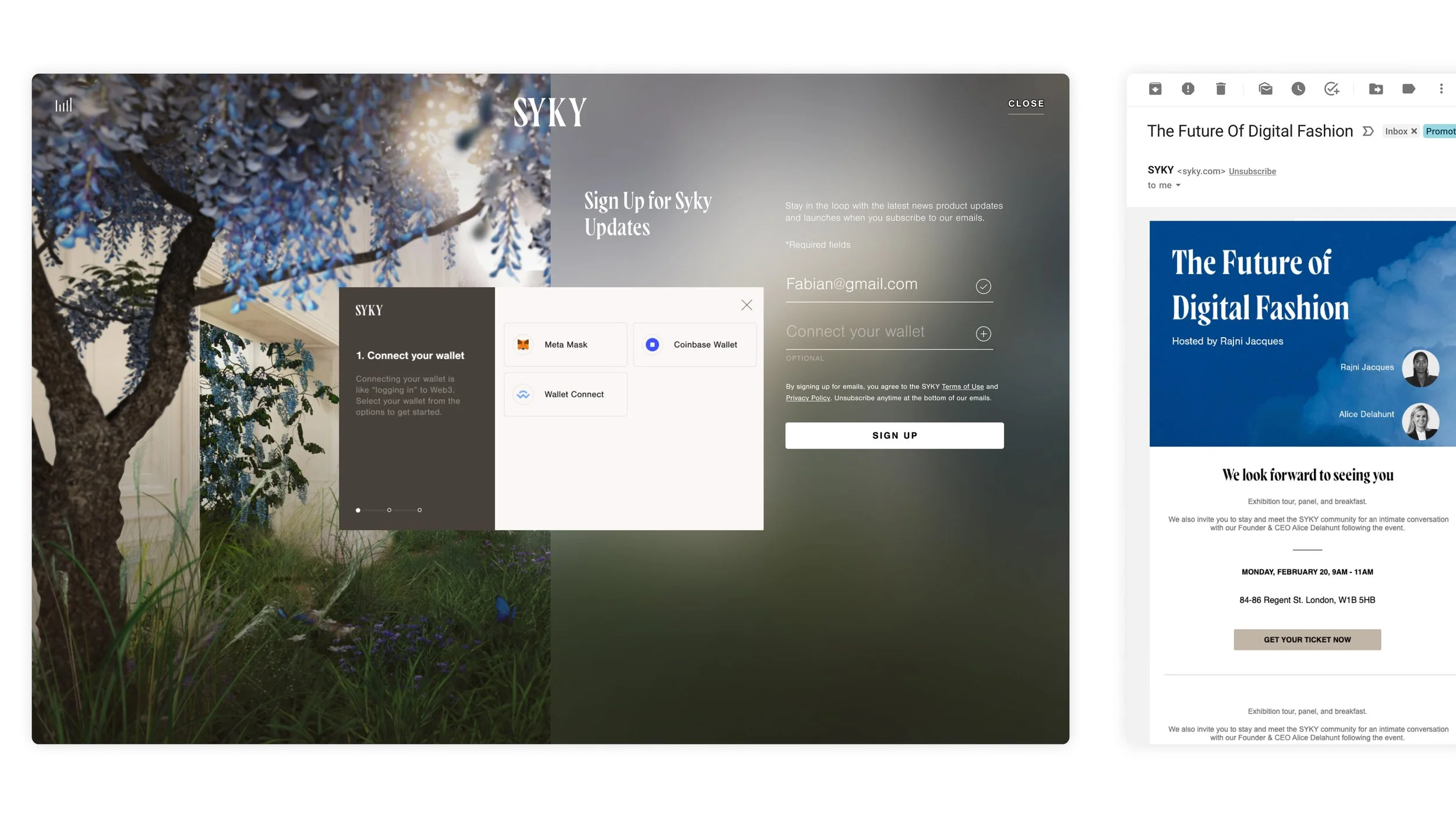
Improvements to Members Log In
PROBLEM
Members were dropping out of the login flow because it was unclear what was being asked of them, and the navigation elements were placed differently from the main site.
SOLUTION
I made every screen state the required action, brought the flow into a single, consistent visual language, and wrote instructional copy at each step so nobody had to guess what came next.
Improvements to Members Area
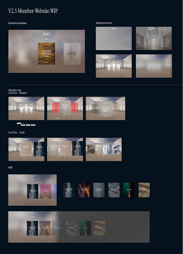
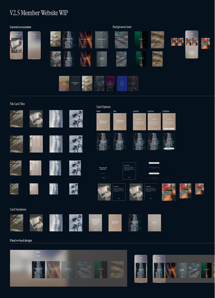
PROBLEM
As we introduced more trend reports and other categories like events, the notification carousel filled up, and members could no longer tell one tile from another or filter for what was relevant to them.
SOLUTION
A dedicated application path to the pass, written and designed as an invitation to the next generation of designers, with the platform’s ethos carried through the form itself.
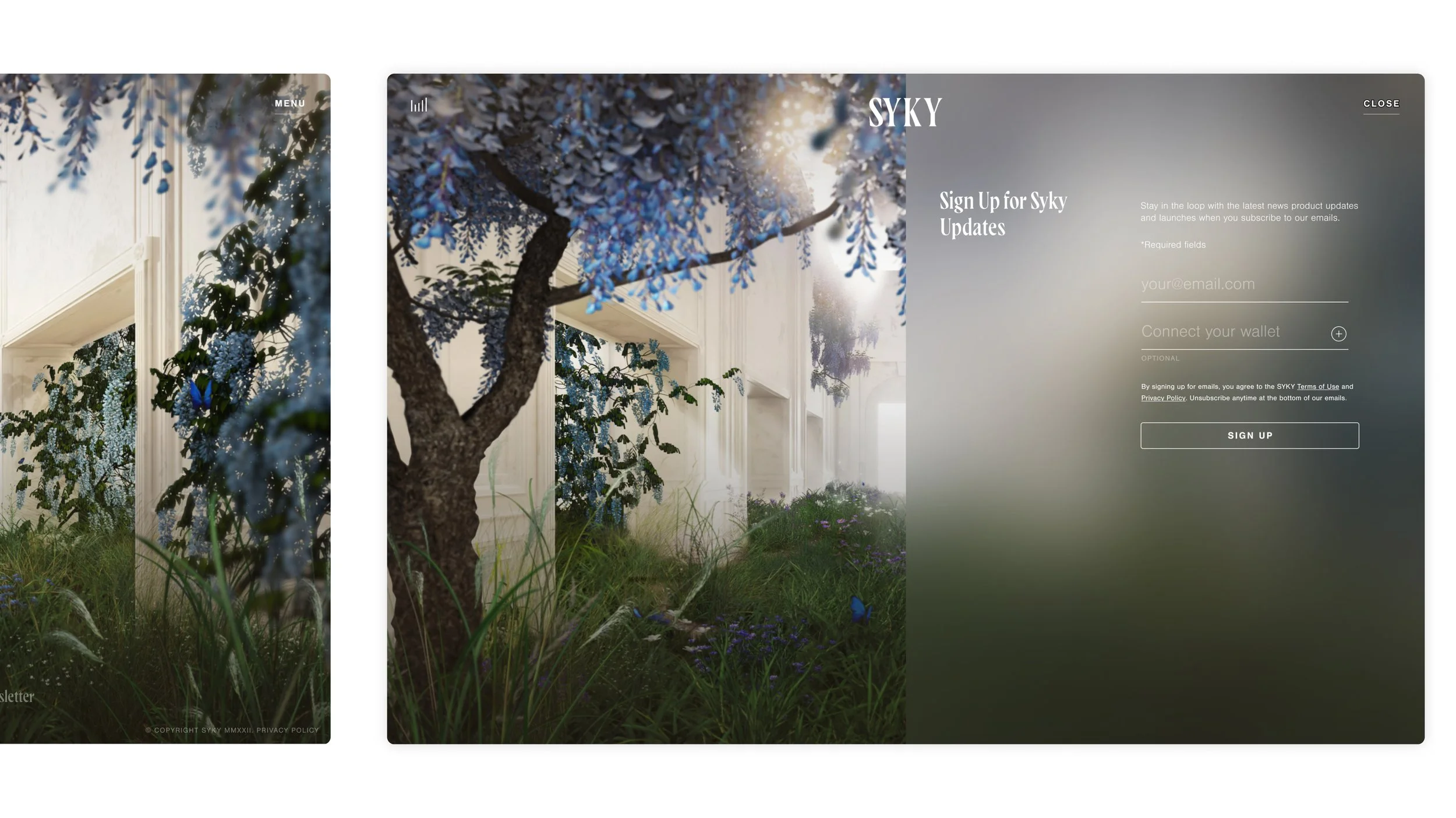
Email Sign-Up
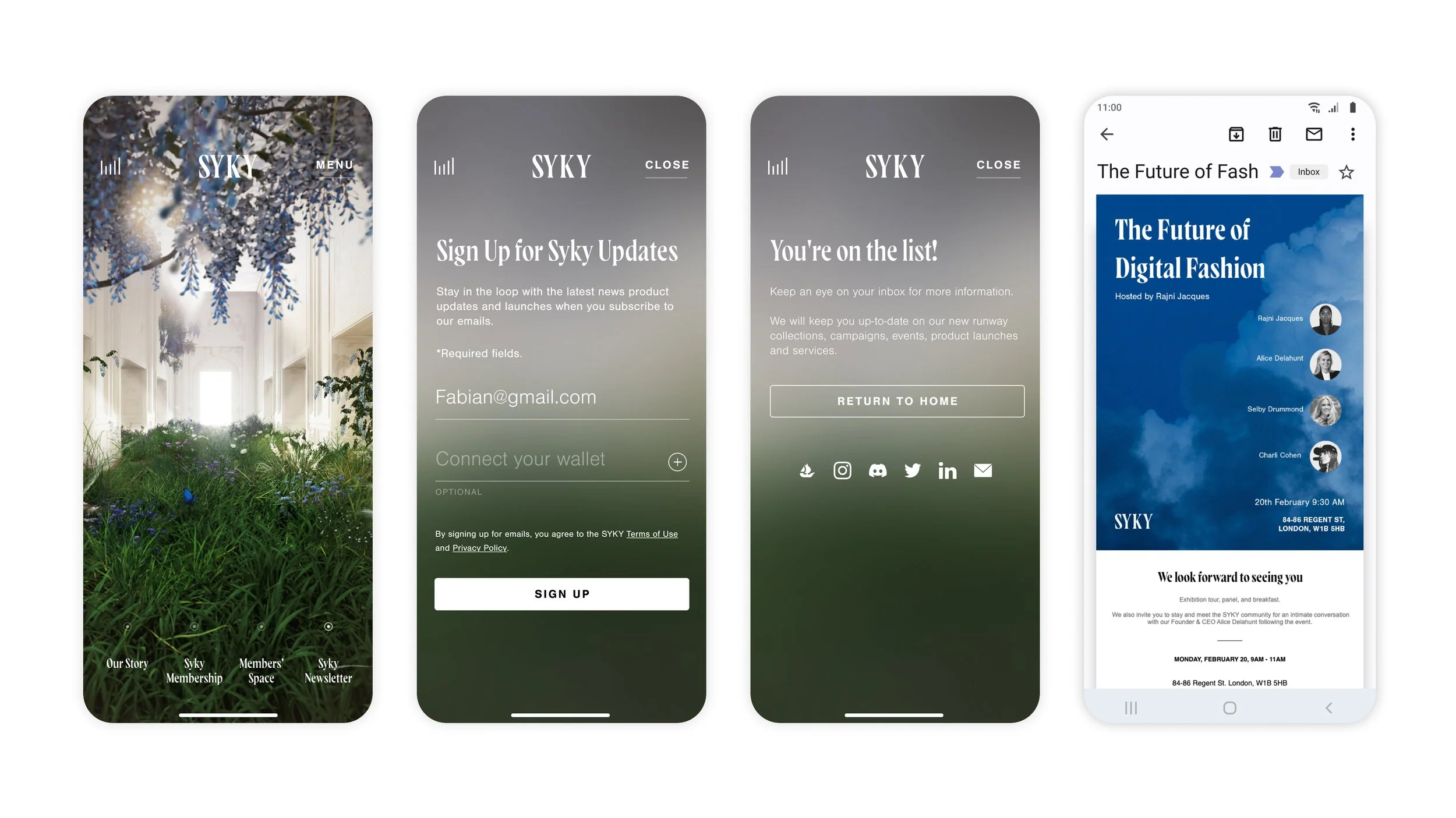
PROBLEM
The site was drawing frequent unique visits with no way to capture an address or build anticipation for all the new marketing activities or feature releases planned.
SOLUTION
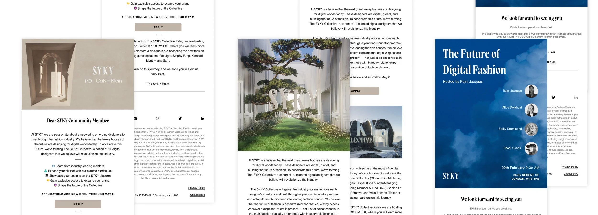
I proposed the capture and designed it as a drawer built on the existing visual language, so visitors could sign up without leaving the page they were on, with fields kept short enough to complete in one go.
Changing the Content of the Website
PROBLEM
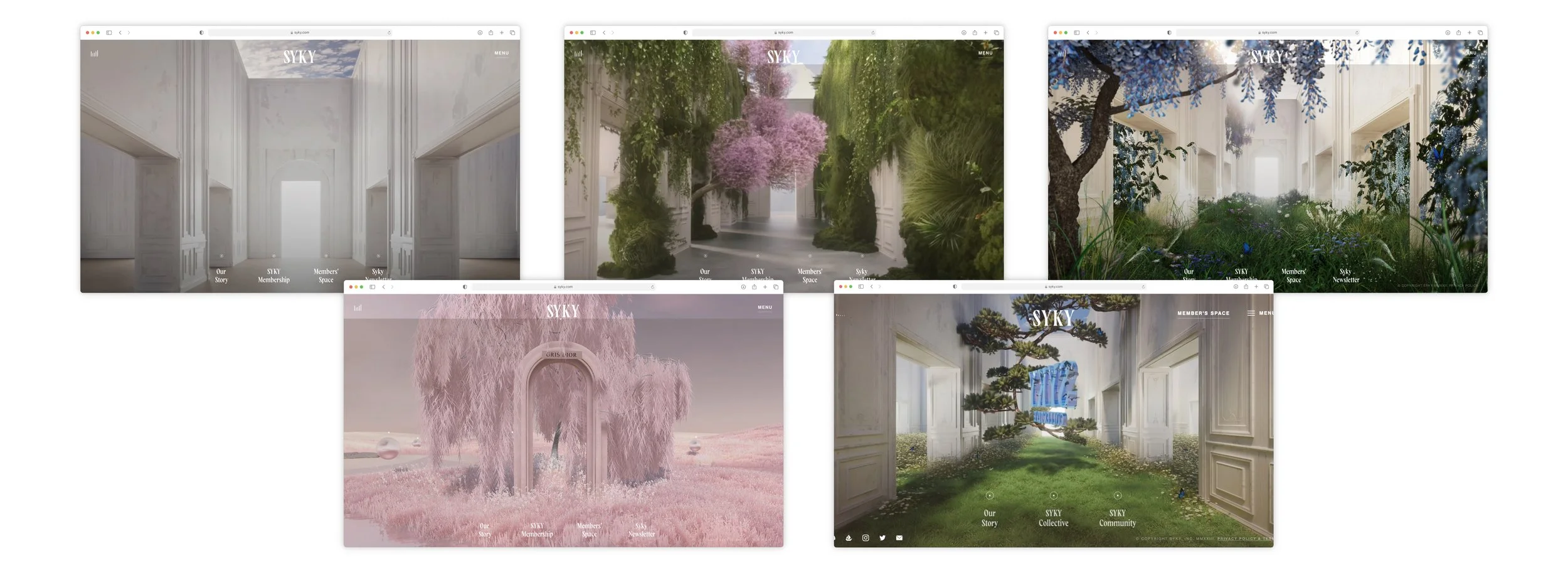
Every new launch raised the same question: how could the site feel fresh and current?
SOLUTION
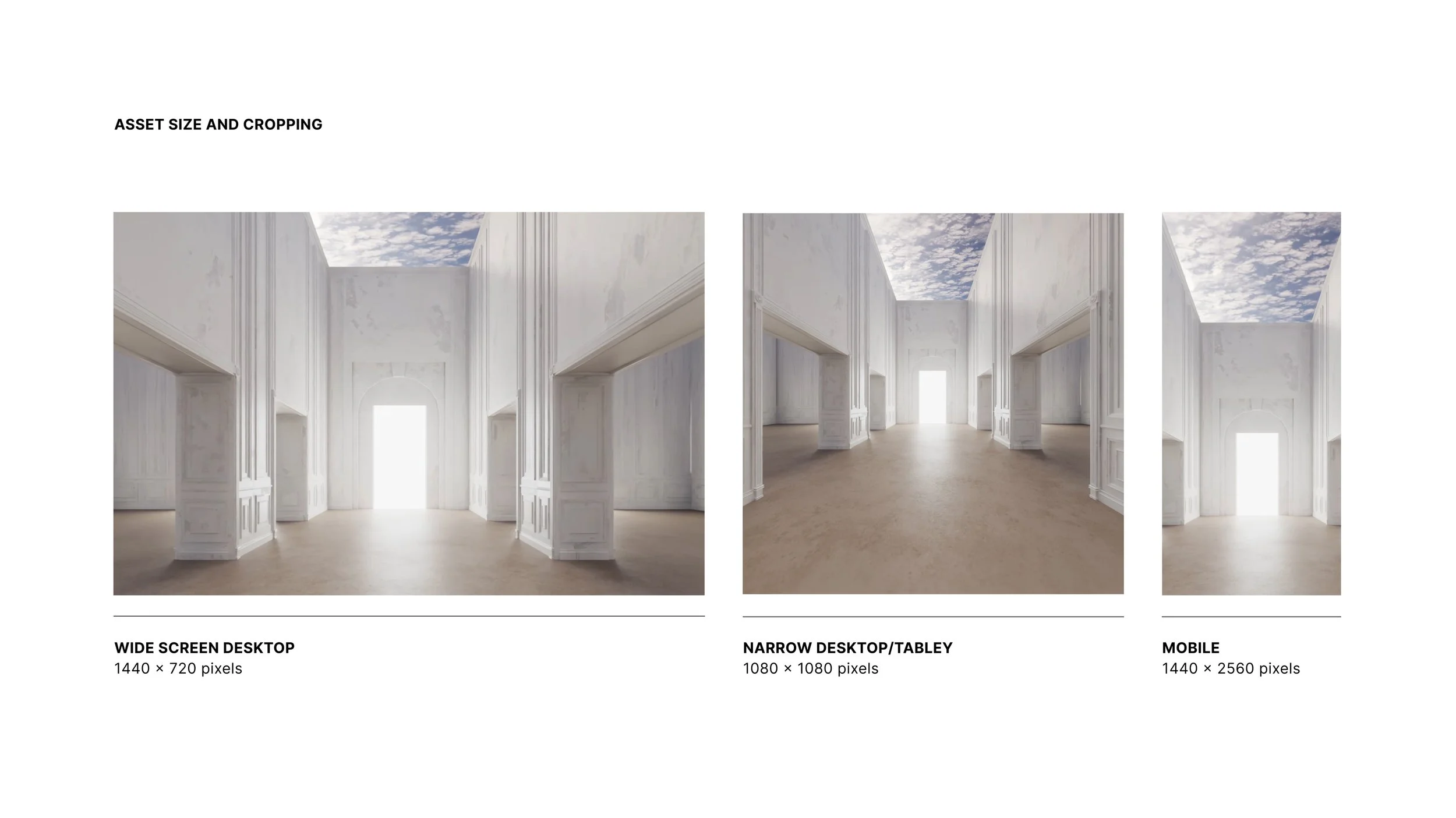
With the CTO and development team, I assessed how the site could accommodate additional content while remaining adaptable, working through the visual and technical constraints together rather than in sequence.
“We believe the next great luxury houses are designing for digital worlds today.”
ALICE DELAHUNT, founder & CEO, SYKY
(Sources: Jing Daily GlobeNewswire)
THE IMPACT
What It Set in Motion
A FOUNDATION BUILT TO SCALE
A multi-product design system became the platform's spine, unifying design under one language, ready to grow without rebuilding.
DESIGN THAT EARNED ITS COVERAGE
From founding concept to a marketplace that launched at London Fashion Week, debuting NFT-backed pieces from emerging designers.