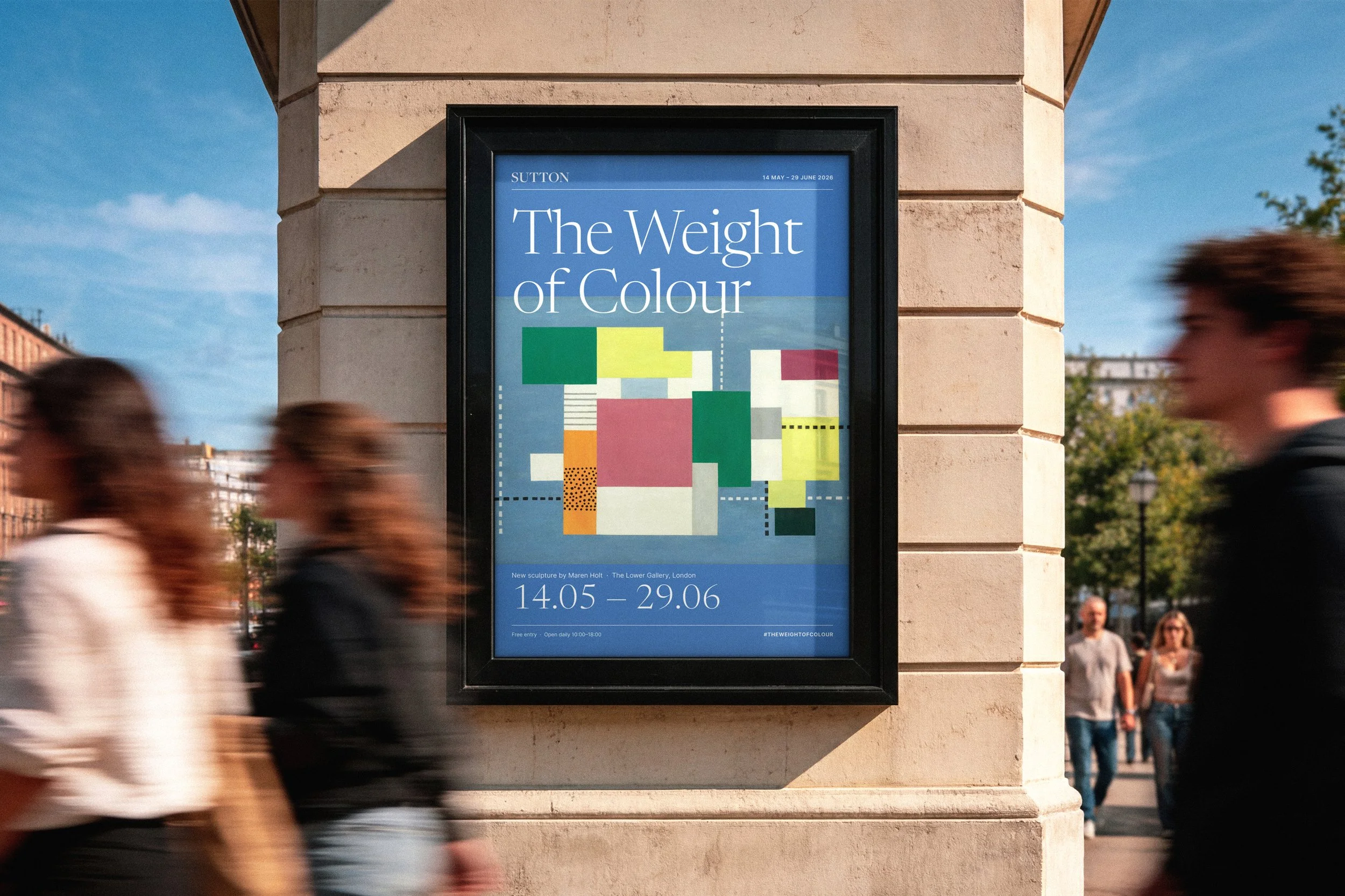
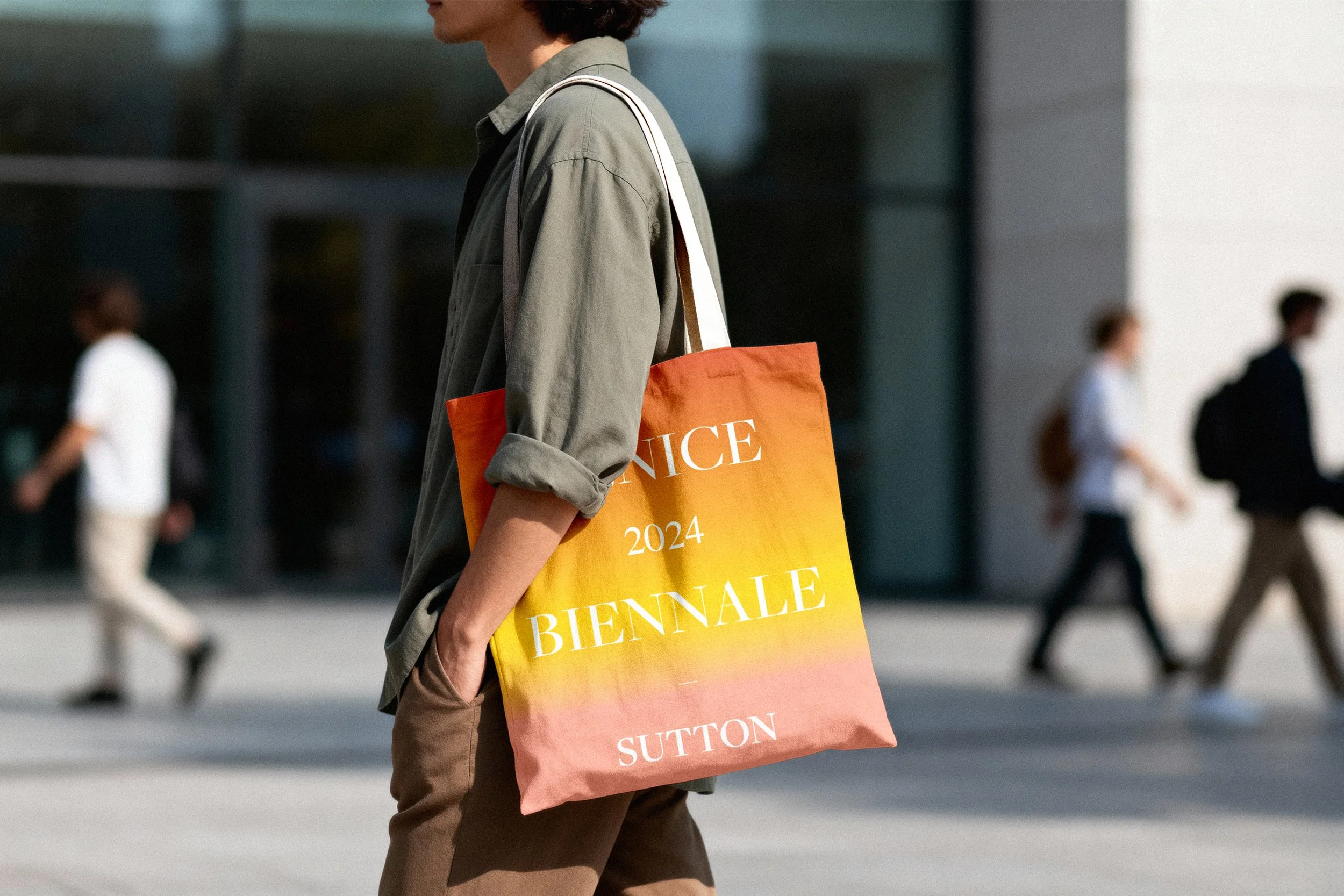
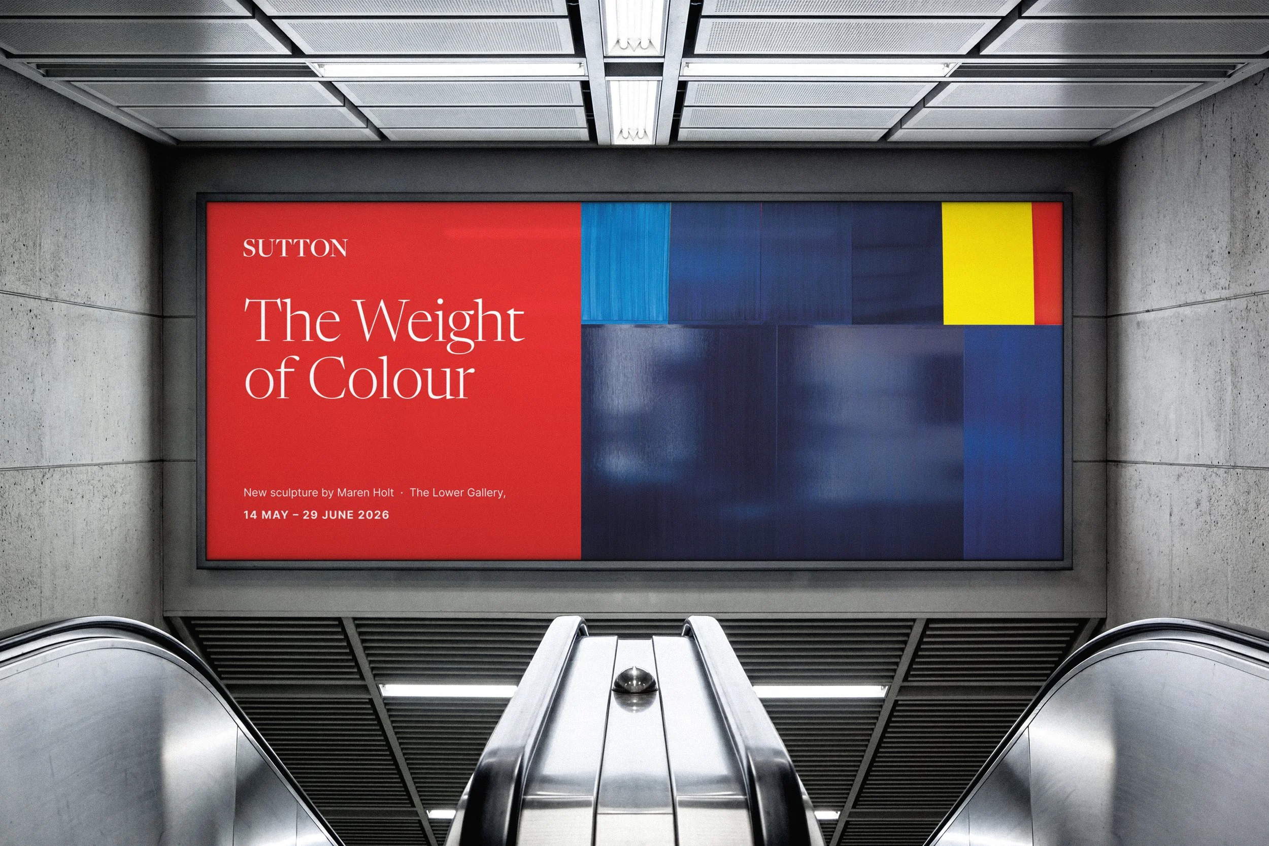
SUTTON
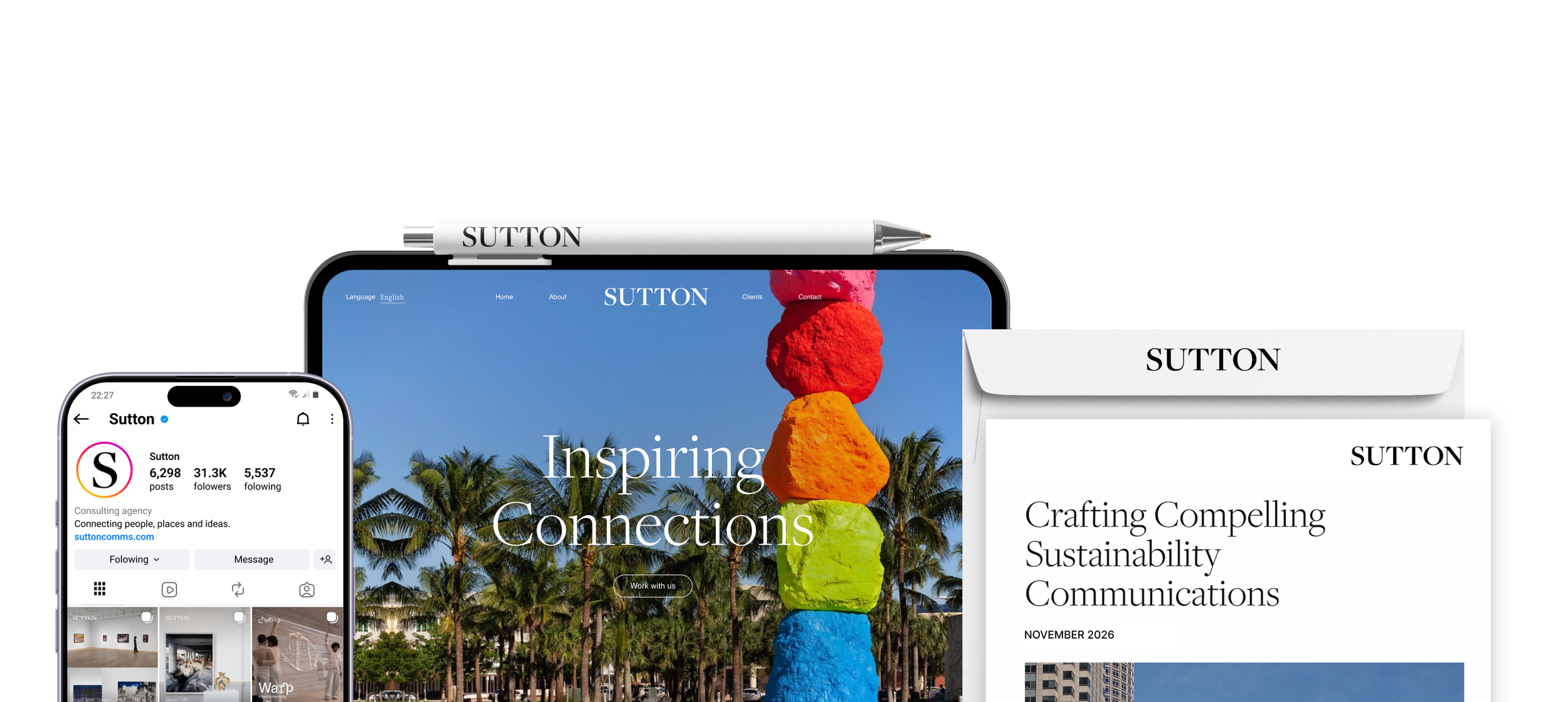
Inspiring Connections
Audit
+
Wordmark
+
Type & Colour
+
Credentials
+
Website & Design System
+
Print & Merchandise
+
Audit + Wordmark + Type & Colour + Credentials + Website & Design System + Print & Merchandise +
IN ONE LINE
Rebranding Sutton, an arts PR agency, with a new wordmark, a website and a simpler look that puts its clients’ art and taste first.
CLIENT
Sutton
ROLE
Creative Director & UX/UI
SECTOR
Art & Culture, Arts PR & Communications
TEAM
Head of Global Communications & third-party build agency
The Brief
Sutton works across art, luxury and culture, from offices in London, New York, Hong Kong, Singapore and Paris. In its own words, it had over 250 clients in more than 15 countries.
The brief named the problem plainly: the brand looked "too corporate" and "too inaccessible", but it still had to feel "sophisticated enough" for everyone from luxury houses and car brands to small arts charities.
Start with what visitors see.
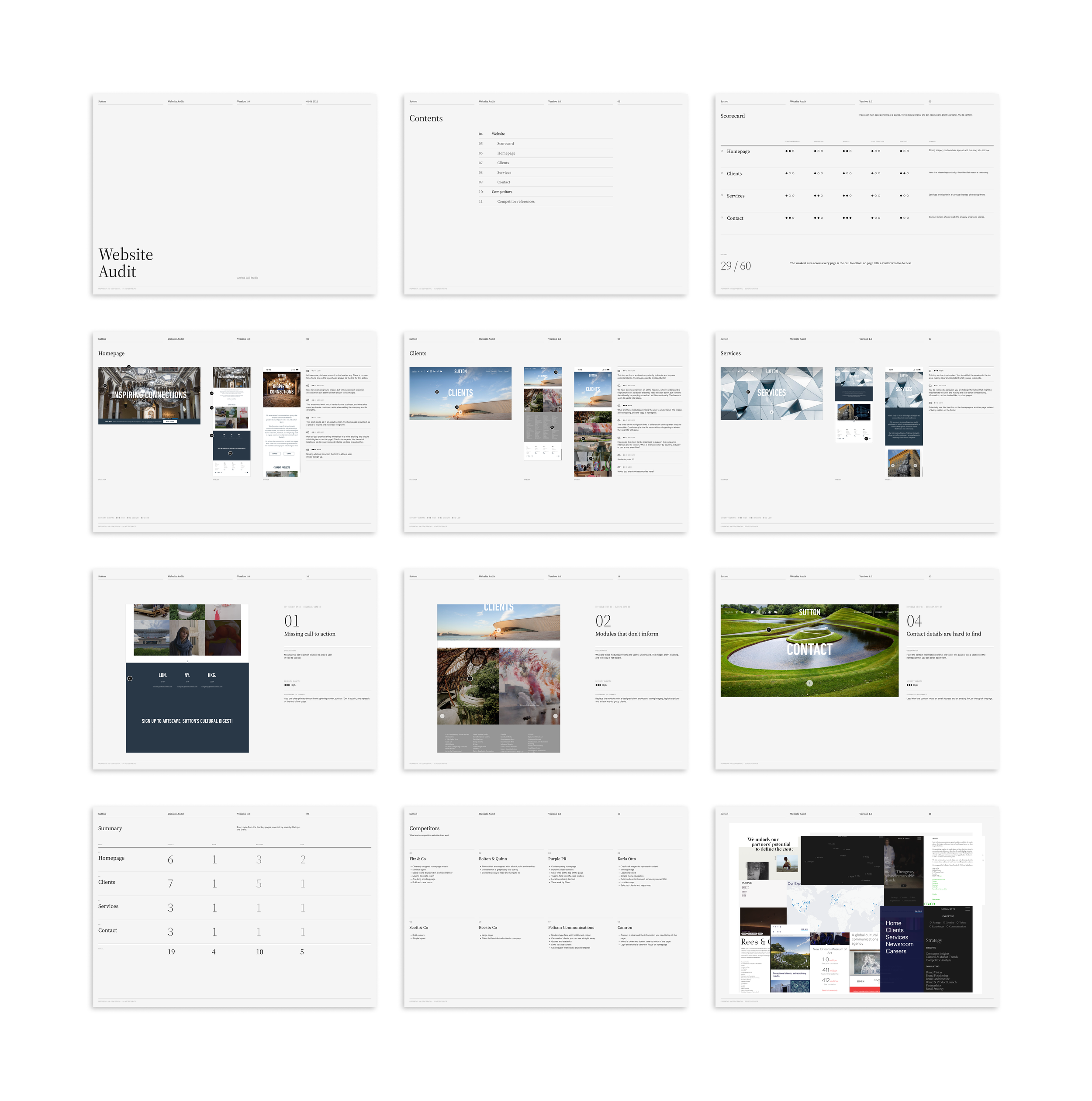
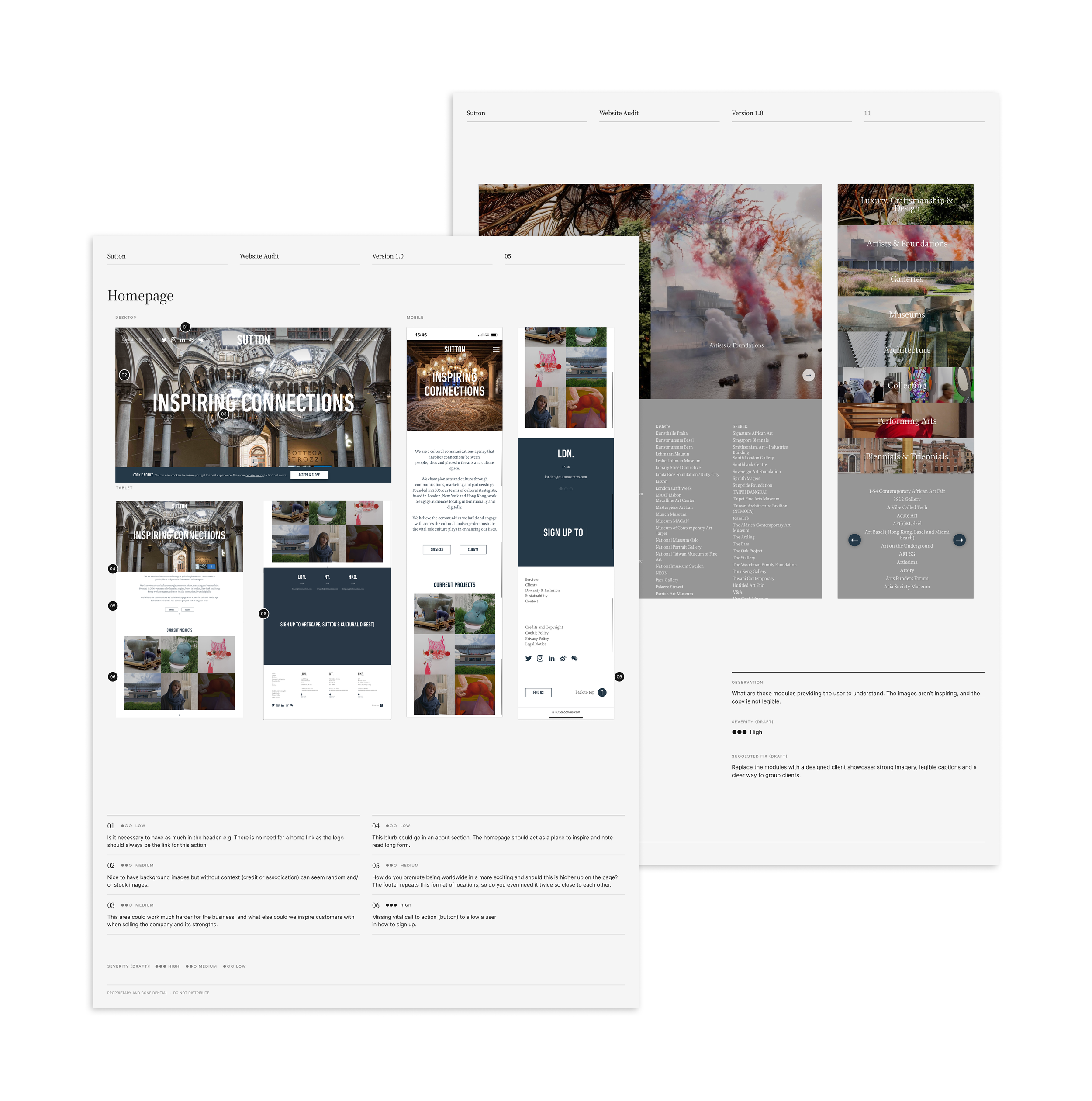
We began with the website. Page by page, we noted what to keep, cut and fix, and compared Sutton with eight of its peers. The clients page was the most-visited page on the site, so we tackled it first.
One Word, Set With Care.
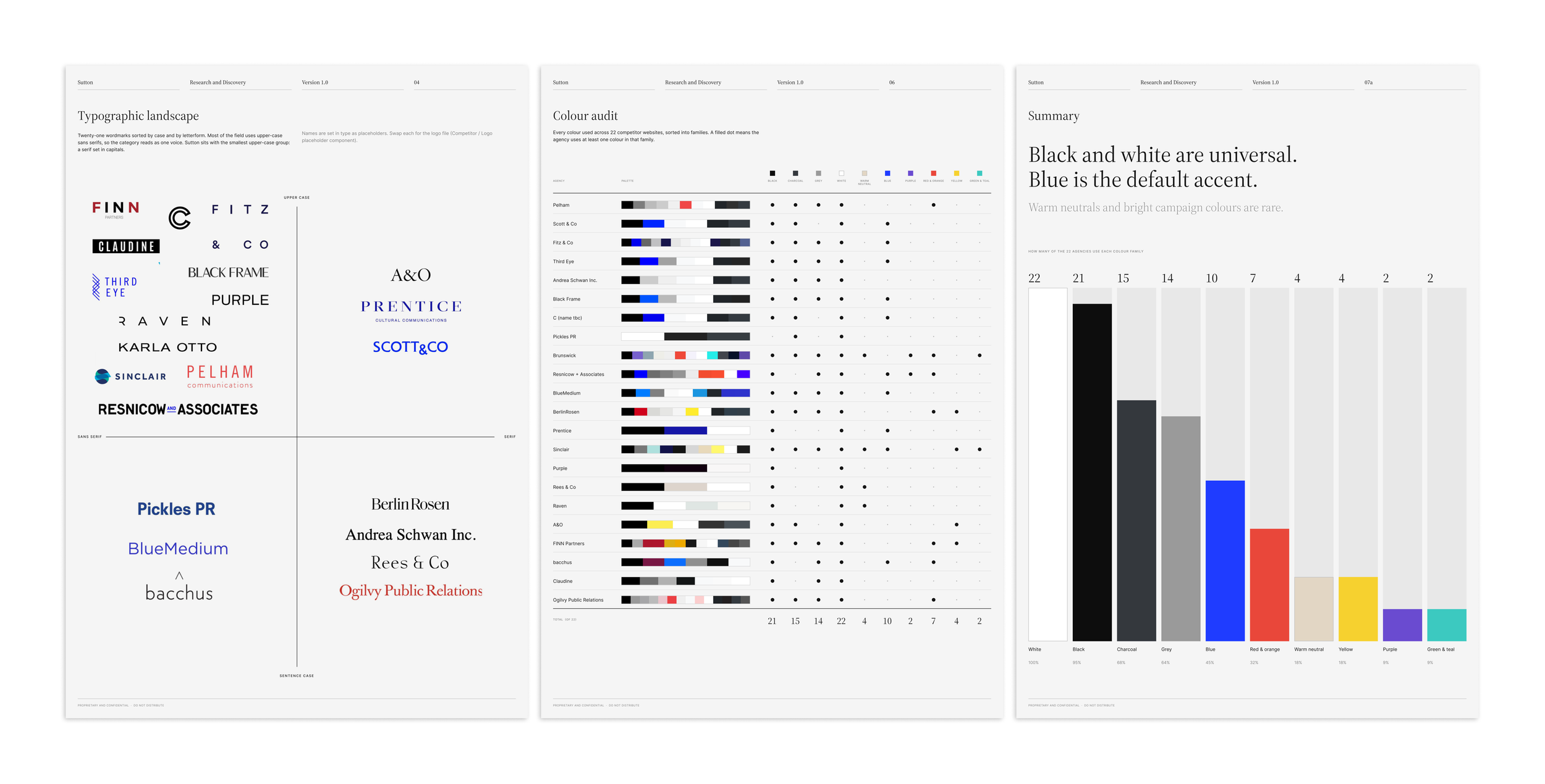
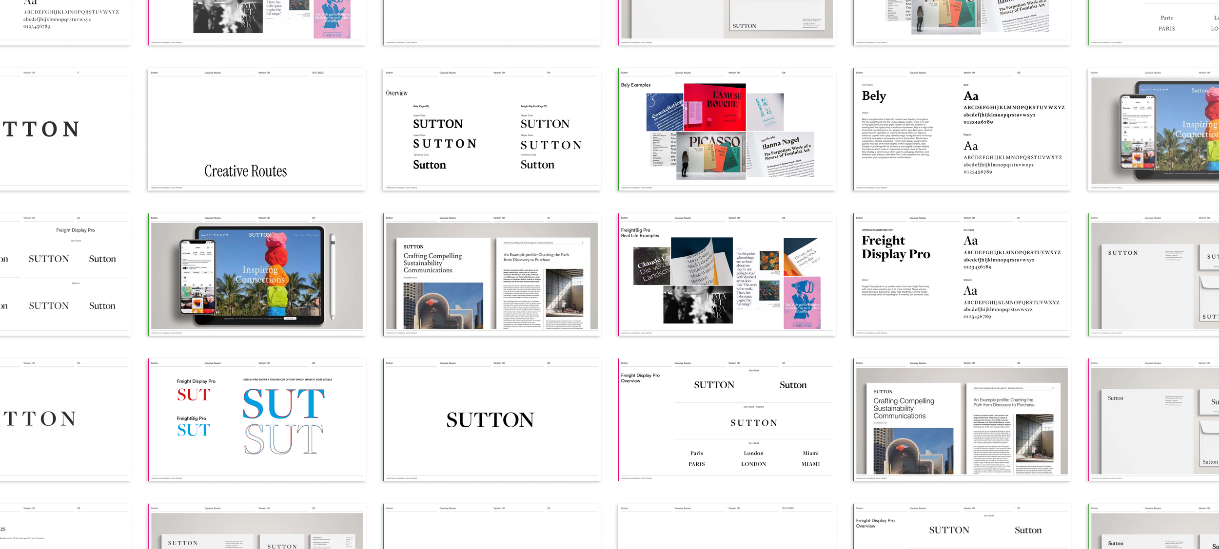
Research came first: how peer agencies set their names, and the colours they use. Then four typefaces, two sans and two serif, each in capitals and sentence case. Two serifs went through to a final round, tested on stationery, Instagram, the website and documents.
From One Word to a Whole System.
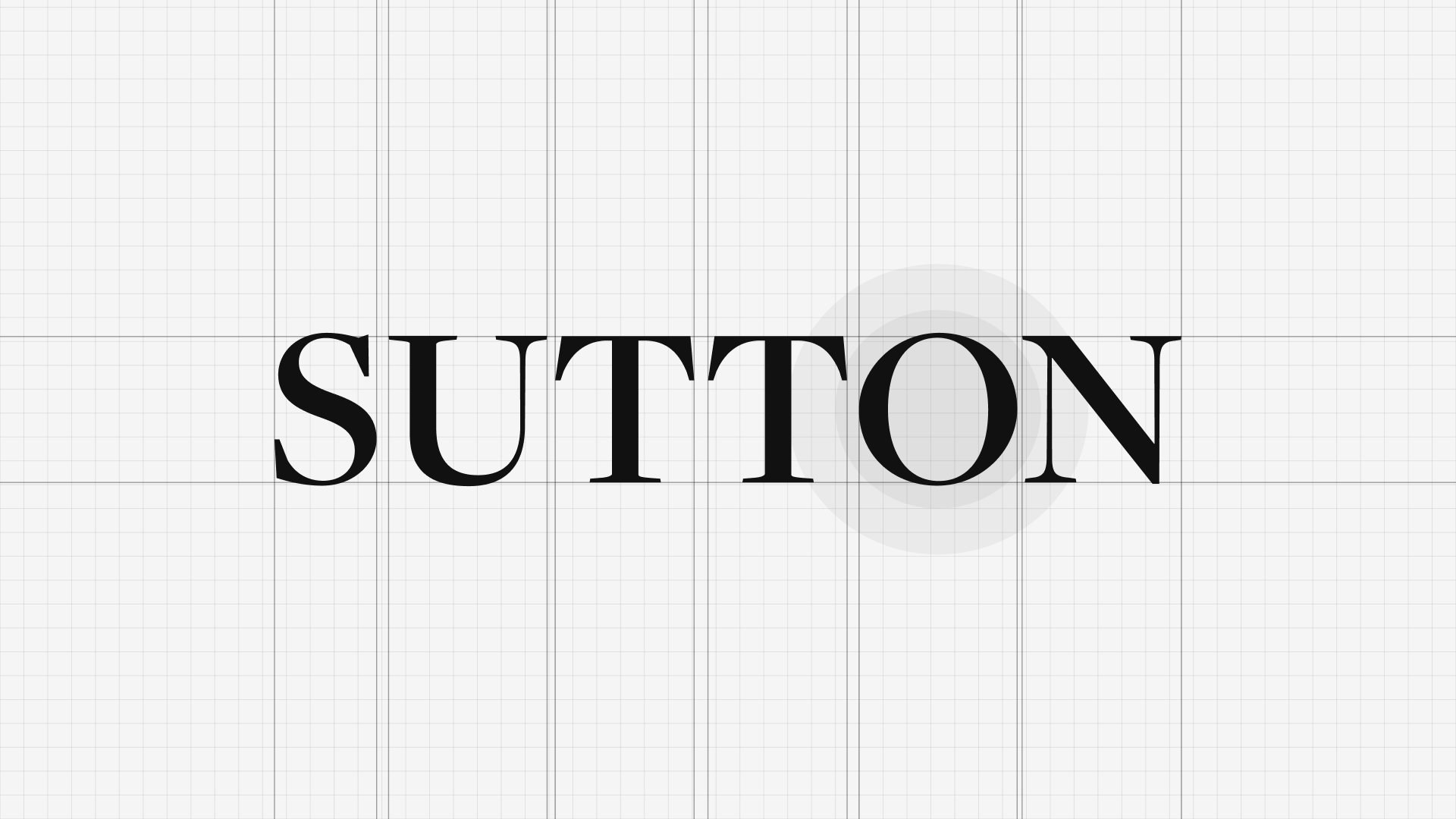
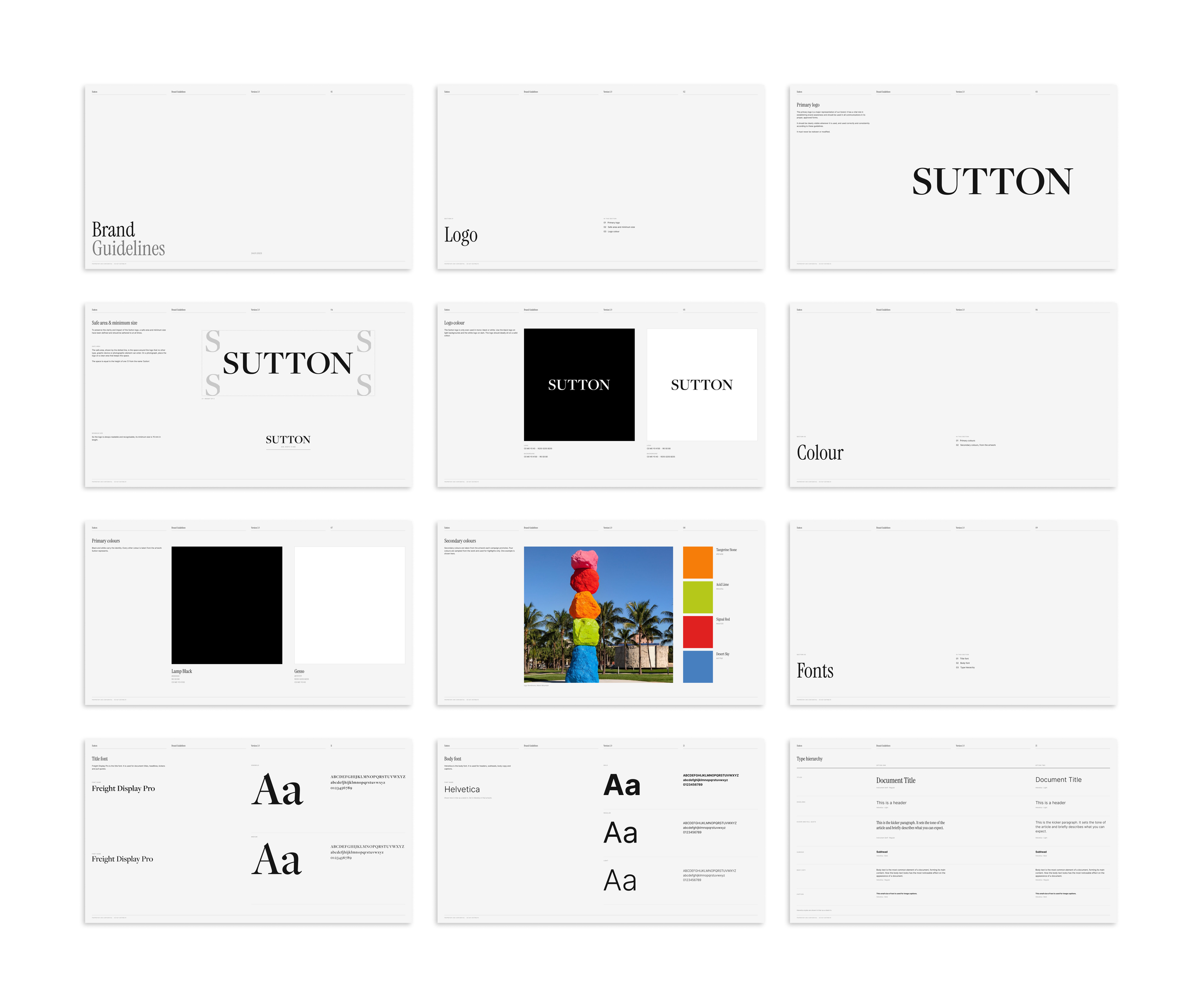
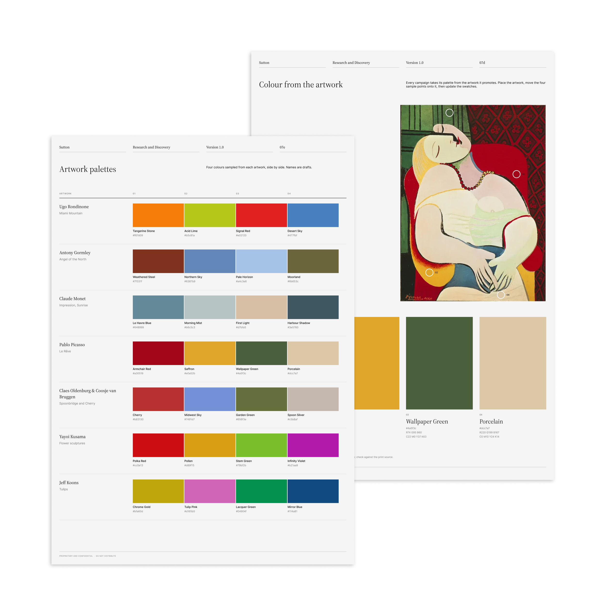
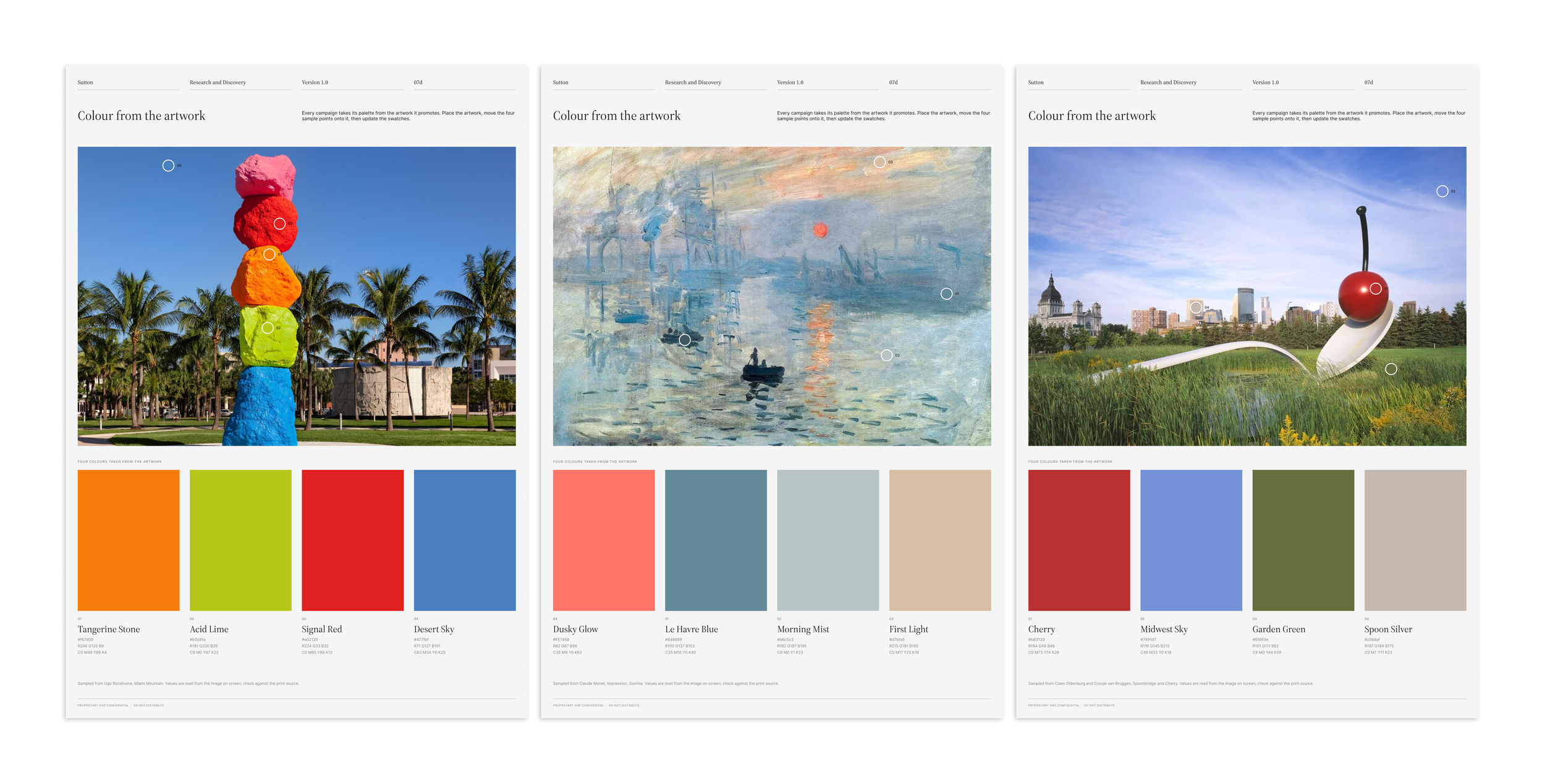
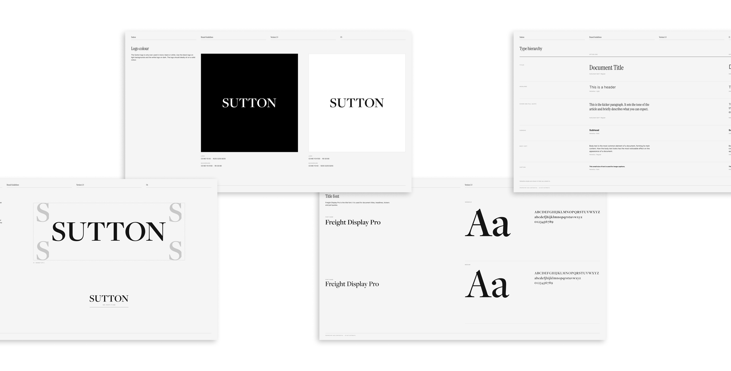
Once the wordmark was signed off, I turned it into a system the team could use without me. I drew a construction grid and anchor points so the mark is always set the same way, defined clear space so it never feels crowded, and created a logo mark for small spaces like social icons. A primary and tertiary palette, with the ability to flex colour ways from the art that was being features, gives each office and occasion its own voice while staying clearly Sutton. A typography list completed the set, all brought together in a short guidelines document.
Too Good to Skip to the Last Slide
Sutton wins work with its credentials deck. We rebuilt it as an editorial system: full-bleed art on the cover, colour-blocked section dividers, simple diagrams and a team page, all as templates Sutton's team can fill in themselves. Six colour groups were tested before one was chosen. A Traditional Chinese edition followed for the Hong Kong office.
Fewer Sections. More Effect.
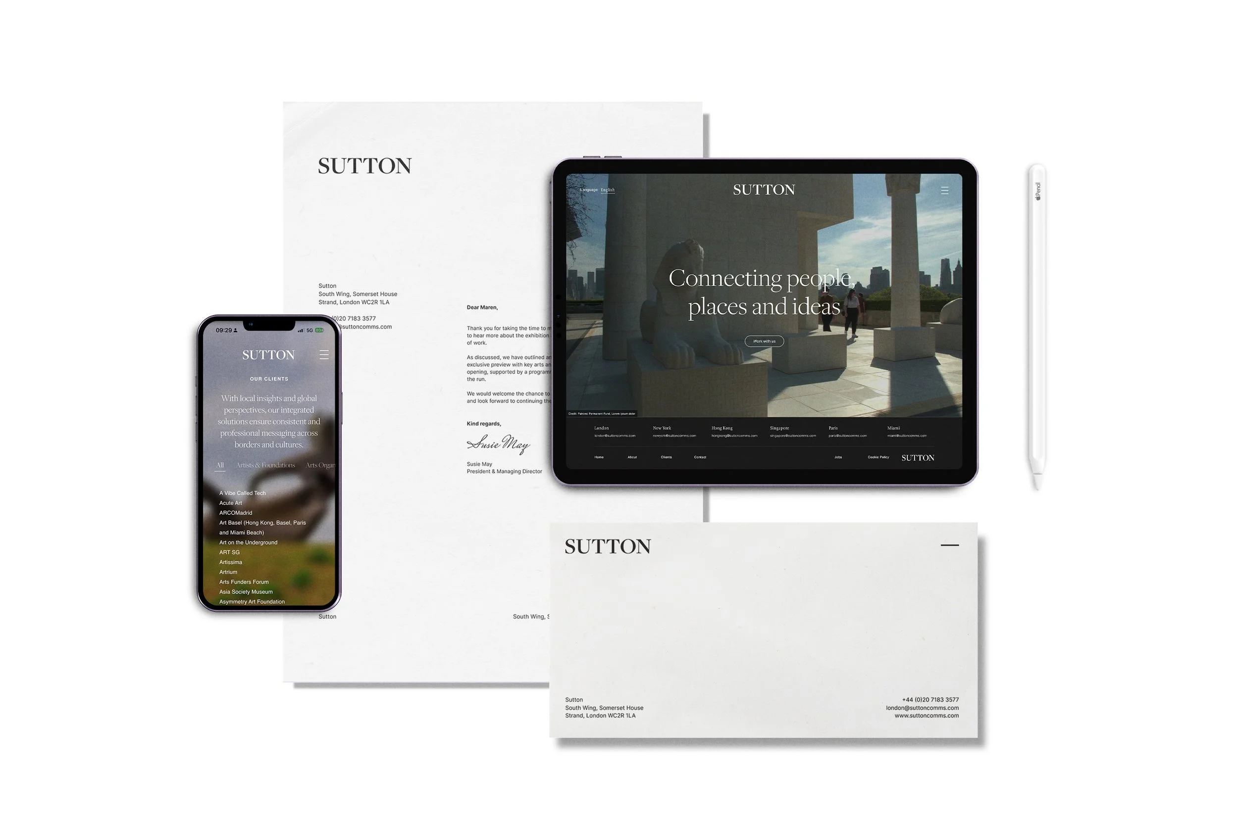
The new site opens on a full-screen film behind a short line: "We produce. We service. We commission." We redesigned the homepage, header, client and contact pages and the footer for desktop and mobile, with a language switch for English, Simplified and Traditional Chinese, French and Spanish. The new brand fonts then ran across the whole site.